Case study
Bhoomiyug
Discovery & Positioning
Brand Story
Bhoomiyug is a regenerative dairy movement rooted in Maharashtra, founded to bridge sustainability with spirituality. Visionary Bhausaheb Dhebe Patil established the brand to restore consumer trust through an uncompromising commitment to ethical farming.
The operational model prioritizes absolute animal welfare. Livestock receive ayurvedic care, clean water, and nutritious feed within a humane environment. This approach yields unpasteurized, chemical-free milk delivered with complete transparency.
Beyond a product line, Bhoomiyug serves as a blueprint for modern agriculture. By synthesizing traditional wisdom with contemporary methods, the brand defines a new era of the soil dedicated to ecological balance and future generations.
Bhoomiyug’s journey with Lightbugs
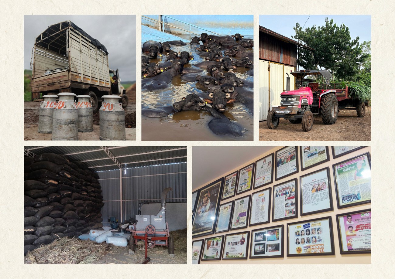
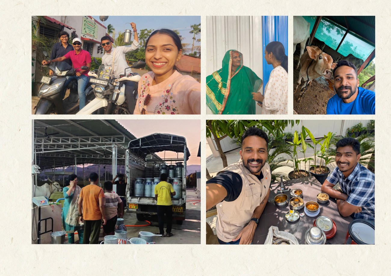
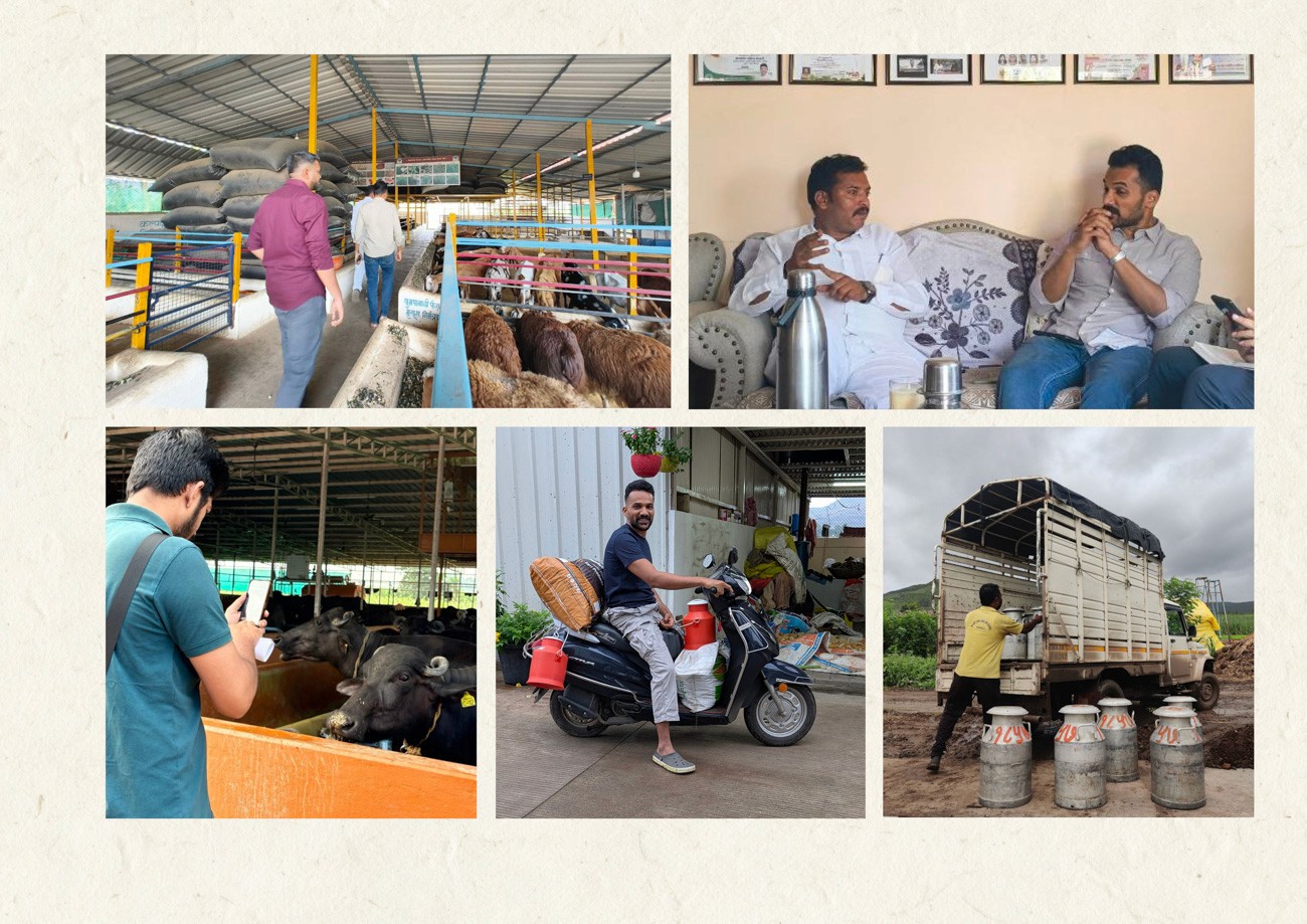
The collaboration between Lightbugs and Bhoomiyug began in 2024 during a pivotal site visit. A conversation with founder Bhausaheb Dhebe Patil revealed a narrative of resilience, tracing his path from a humble farming background to managing diverse agri-businesses.
This personal history provided the strategic foundation for the project. The team identified an immediate synergy between the founder’s vision for ethical, unadulterated dairy and the agency’s focus on purpose-led branding.
Lightbugs recognized this engagement extended beyond standard brand building. The objective shifted to amplifying a movement, positioning the founder as a genuine pioneer of sustainable agriculture and translating his dedication into a compelling market proposition.
The Challange
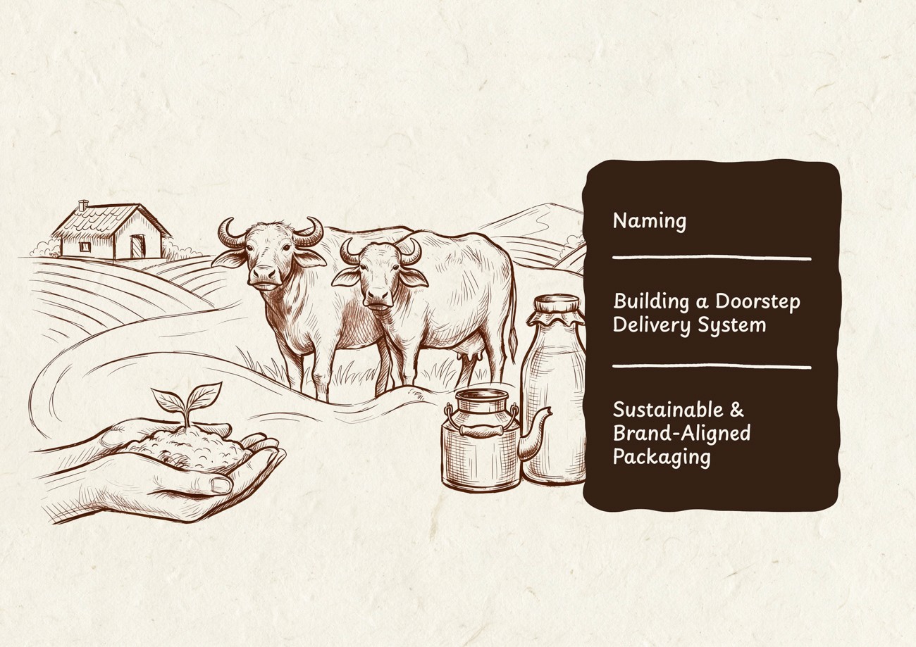
The assignment extended beyond standard brand architecture. The team faced the complex task of naming a movement rather than a commercial entity. The objective was to craft a verbal identity that balanced historical weight with a revolutionary vision, requiring a moniker capable of projecting timeless authority.
Operational design presented a second critical hurdle. The direct-to-consumer model for unpasteurized milk demanded a rigorous logistical framework. Success hinged on developing a packaging solution that was sustainable, tamper-proof, and low-maintenance without compromising the visual system.
Discovery & Positioning
Discovery and Immersion
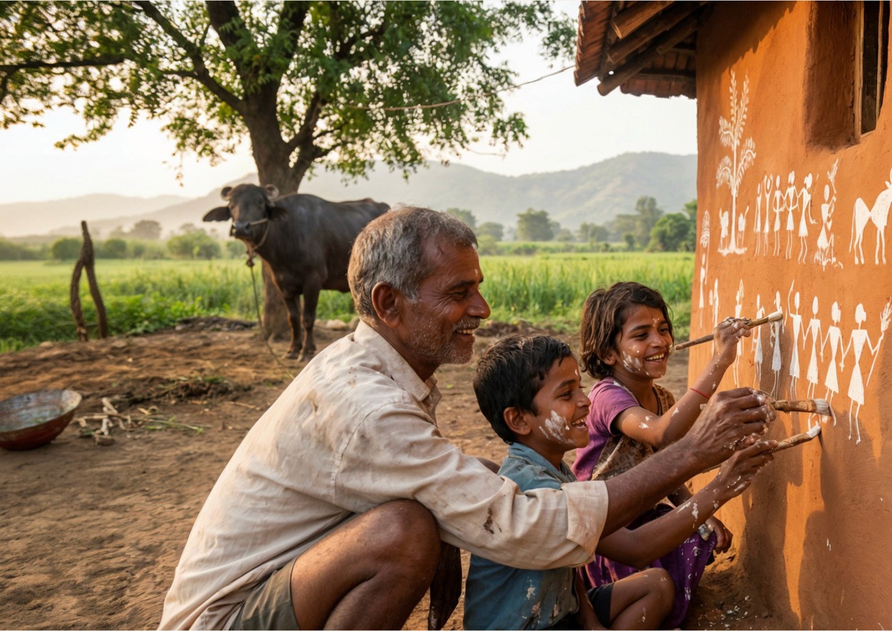
To decode the brand's true DNA, the team bypassed standard strategy decks in favor of deep immersion. We participated in daily farm operations to internalize the rhythm of the business. This process revealed that founder Bhausaheb Dhebe Patil is not merely an entrepreneur but a custodian of a spiritual ecosystem. His philosophy provided the brand's North Star: soil is sacred, and agriculture is an act of devotion.
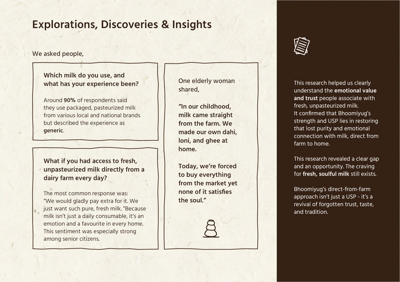
Market Research
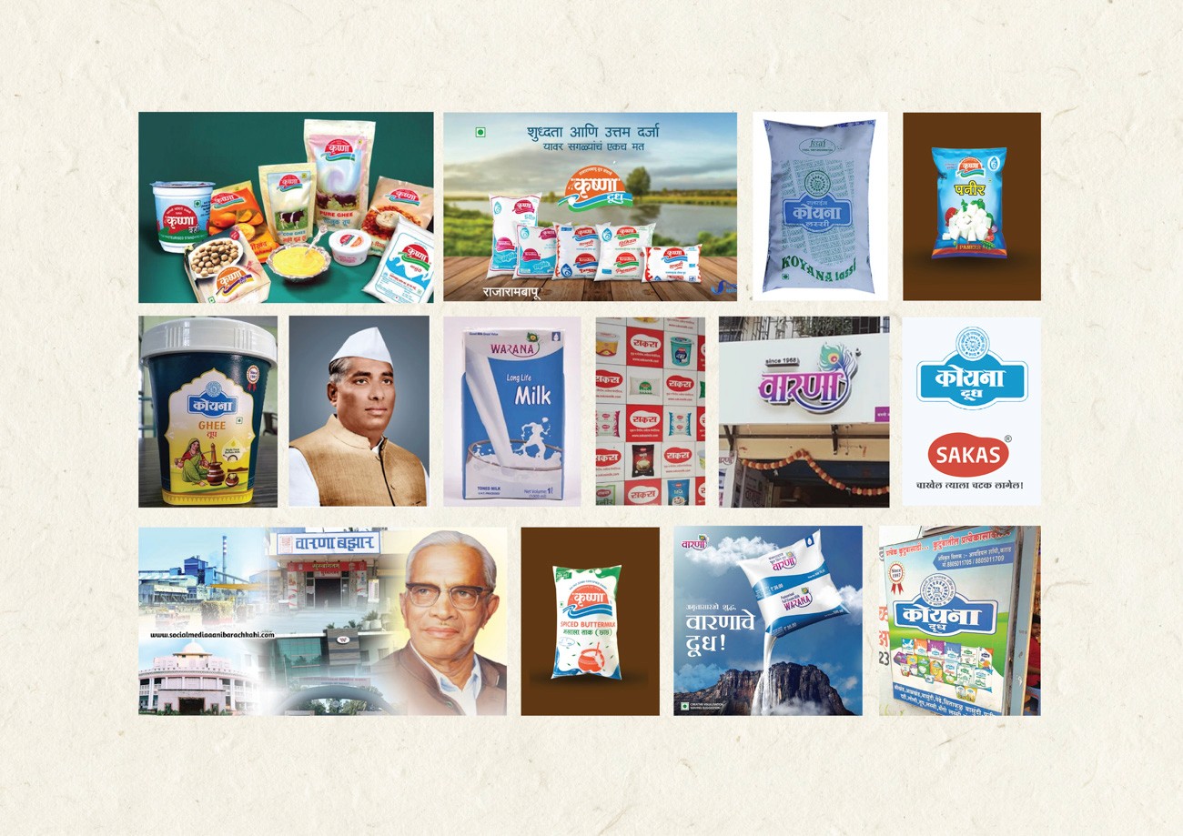
Extensive regional research exposed a critical gap in the dairy market. While 90% of consumers rely on generic pasteurized brands, satisfaction remains low. Interviews confirmed a profound nostalgia for the "soul" of traditional milk, specifically its unadulterated taste and ability to yield superior by-products like ghee and curd. Retailer conversations further highlighted a commodity trap where incumbent brands are indistinguishable, competing on logistics rather than quality.
Strategic Positioning
The analysis pointed to a high-value white space. The market is saturated with convenience-led apps and processed products, yet there is a rising, silent demand for ethical and raw dairy.
The strategy positioned Bhoomiyug to exit the commodity race entirely. Instead of competing on shelf life, the brand competes on the restoration of trust. Bhoomiyug is defined not as a dairy label, but as a regenerative ecosystem that empowers the "sons of the soil" and delivers purity without compromise.
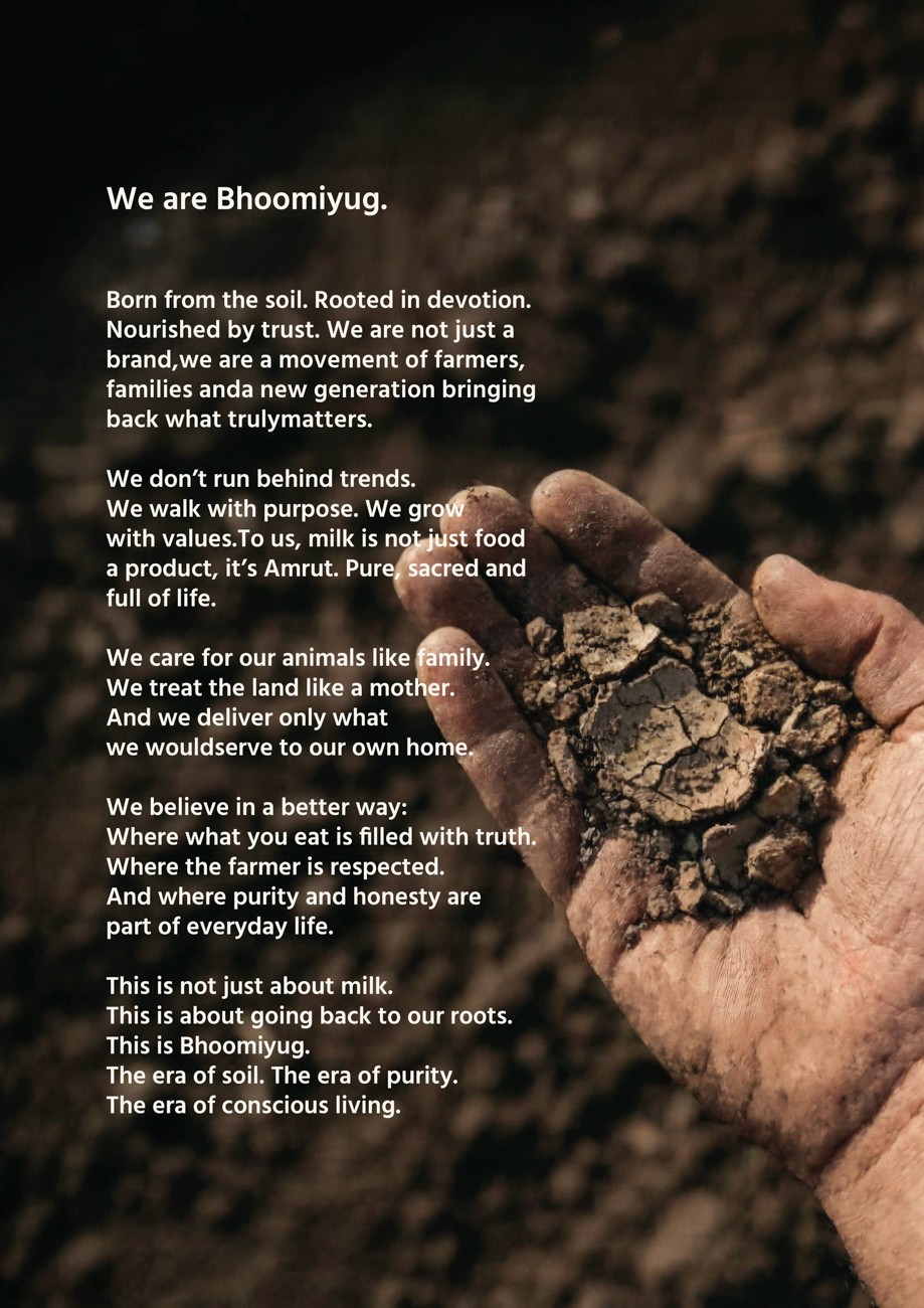
Brand Manifesto
Defining the visual and verbal identity required a foundational belief system first. The strategy moved beyond standard positioning statements to articulate a clear purpose derived directly from the immersion phase.
The resulting manifesto establishes what Bhoomiyug fights for and the future it aims to construct. It anchors the brand in conviction rather than commercial differentiation, ensuring every touchpoint reflects a commitment to the soil and the community.
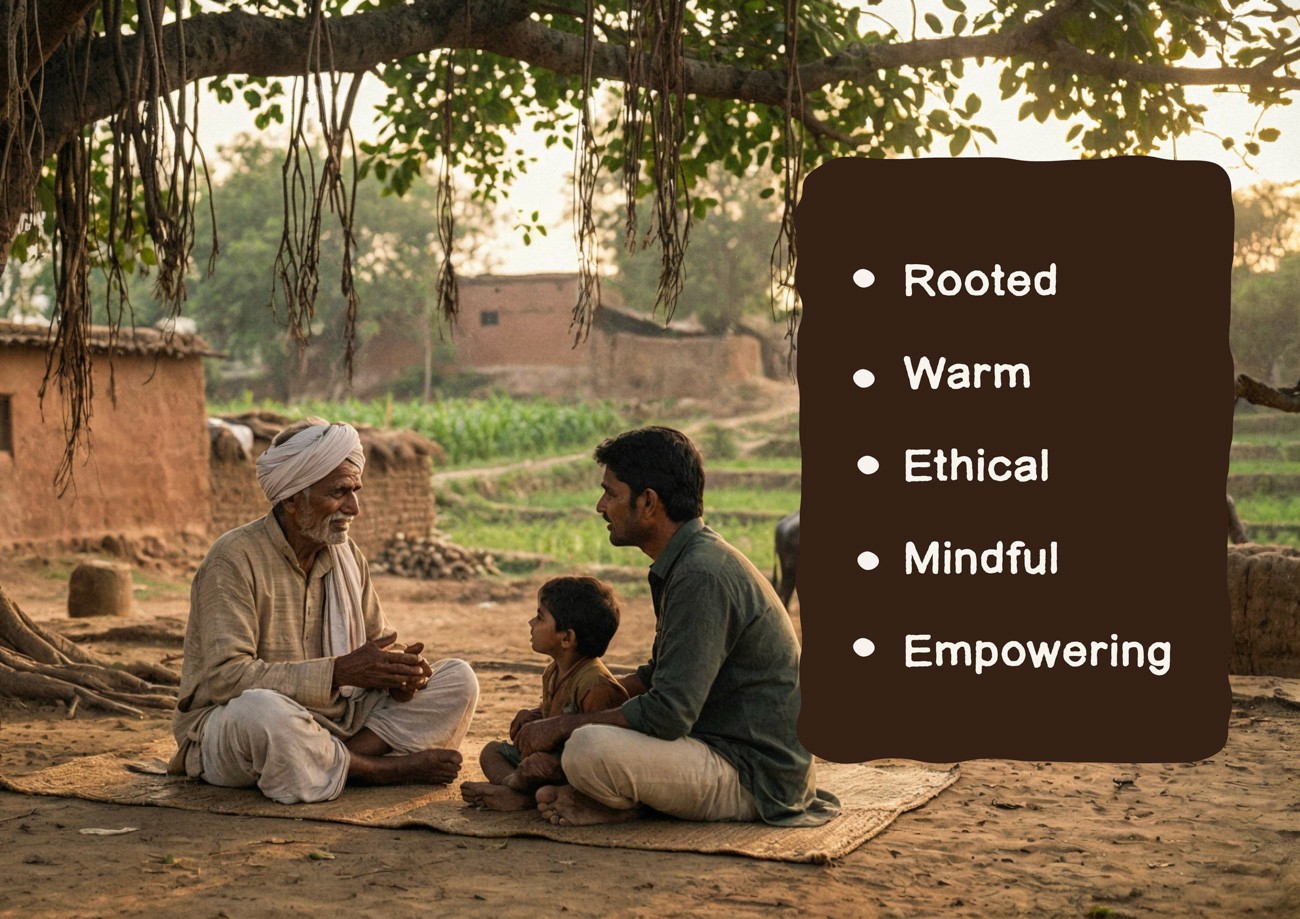
Brand Personality
The team approached brand personality as an exercise in excavation rather than invention. We looked beyond aesthetics to define the brand's true character through its behavior and values.
The resulting persona is not a constructed image. It is an authentic reflection of the founder’s integrity, the community’s warmth, and the quiet dignity of the agrarian ecosystem.

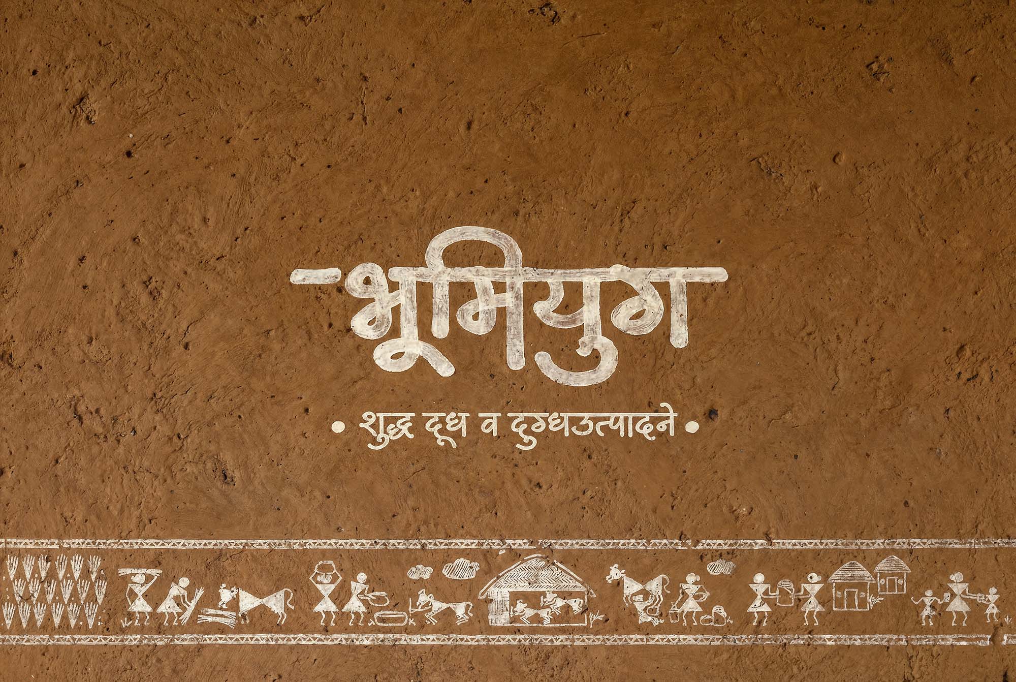
Naming
Sowing Purpose Into Name
The naming phase involved a rigorous exploration of over 50 distinct concepts. The objective was to identify a moniker capable of carrying the weight of a generational movement rather than a simple commercial label. The chosen name needed to bridge ancestral values with a sustainable future.
The result is Bhoomiyug, translating to "Era of the Earth."
This name encapsulates the brand's core philosophy of regenerative living and agrarian devotion. It positions the entity not merely as a dairy provider but as the harbinger of a new agricultural epoch, rooting the revolution firmly in the motherland.
Pouring Purpose into a Name
The selected name, Bhoomiyug, translates to "The Era of Soil." It was chosen to articulate a profound connection to the earth and a strategic return to foundational values.
The moniker serves as a vessel for the brand's core tenets: the dignity of the farmer, the sanctity of the animal, and the truth of the product. It functions as a call to action for conscious living rather than mere consumption.
Ultimately, Bhoomiyug defines a belief system. It marks a shift from commercial branding to a movement rooted in the restoration of nature and self.

Brand Visual Identity
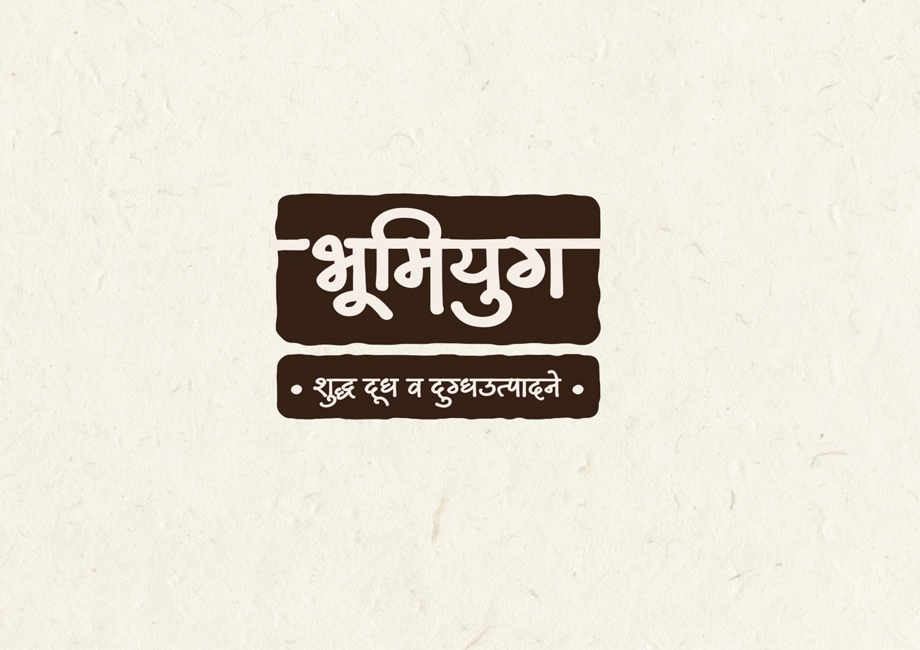
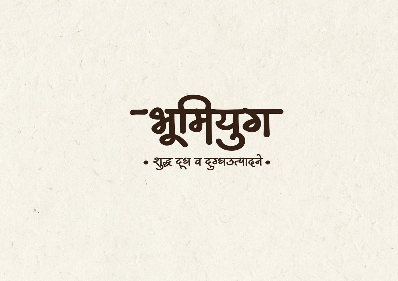
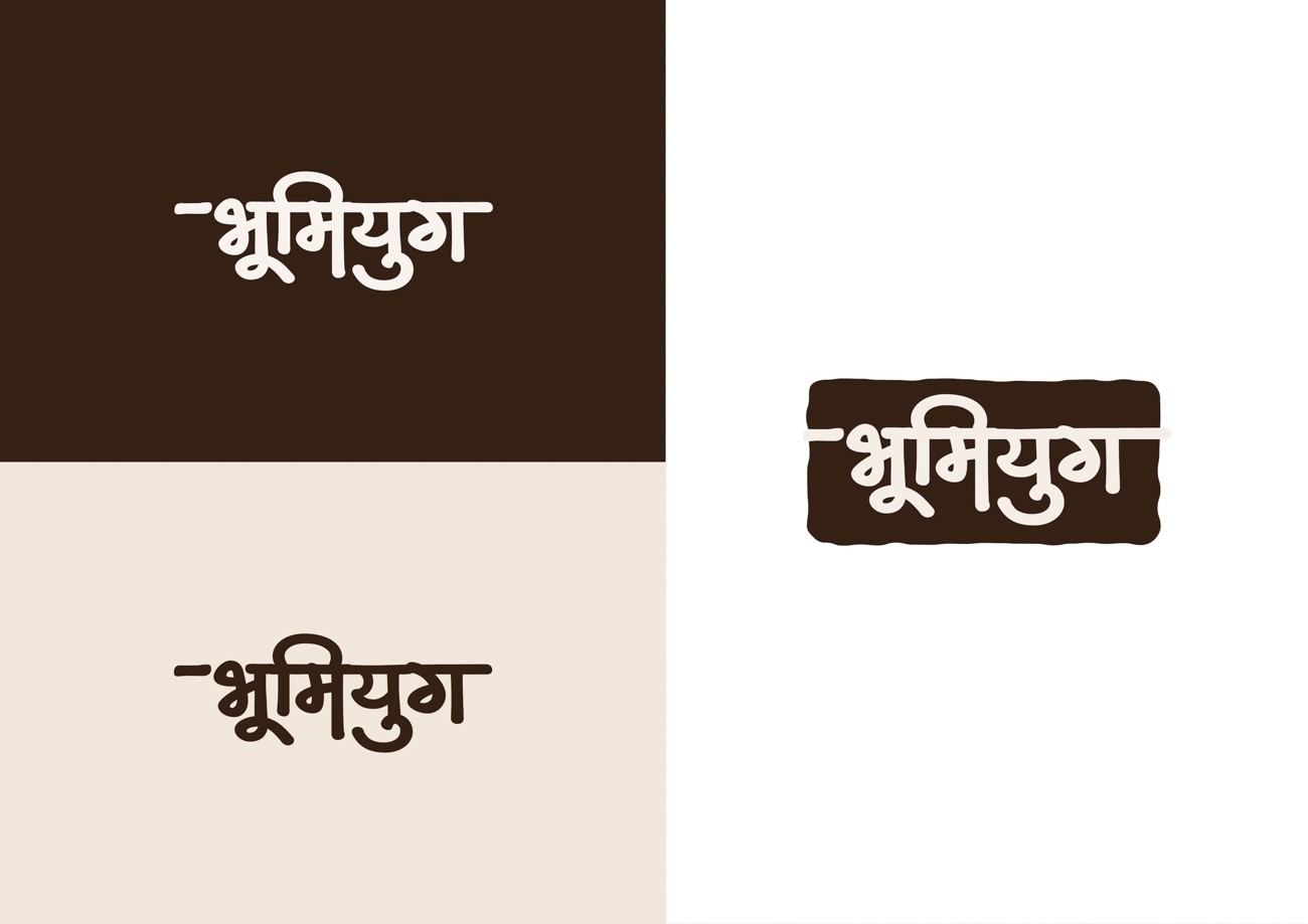
Logo
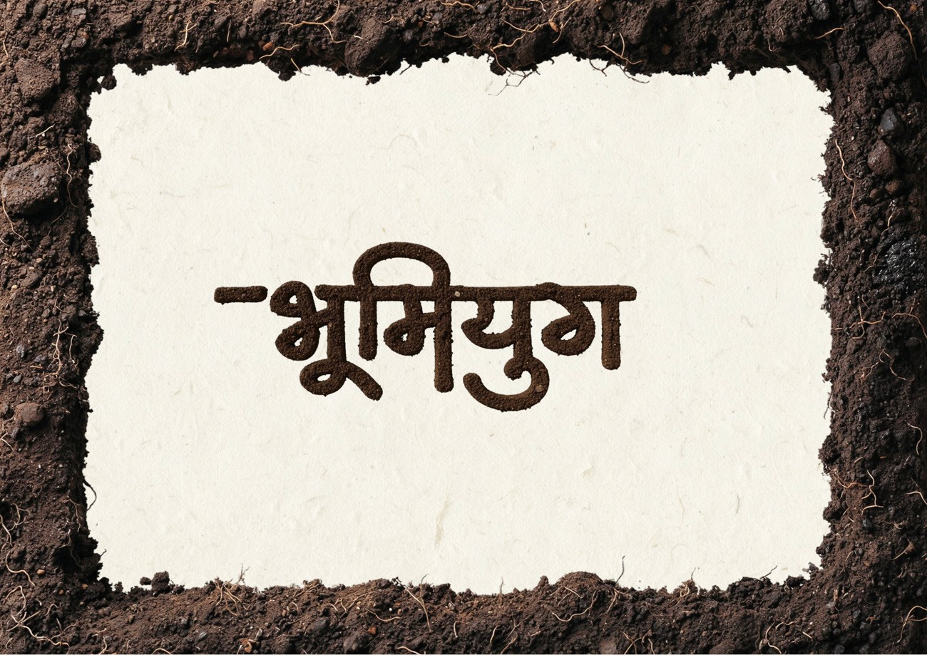
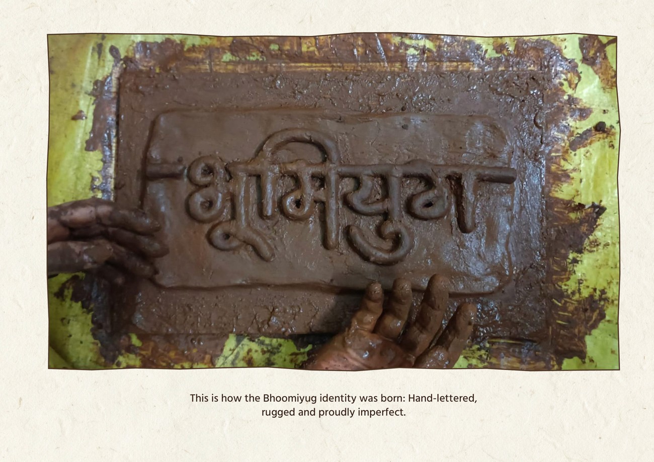
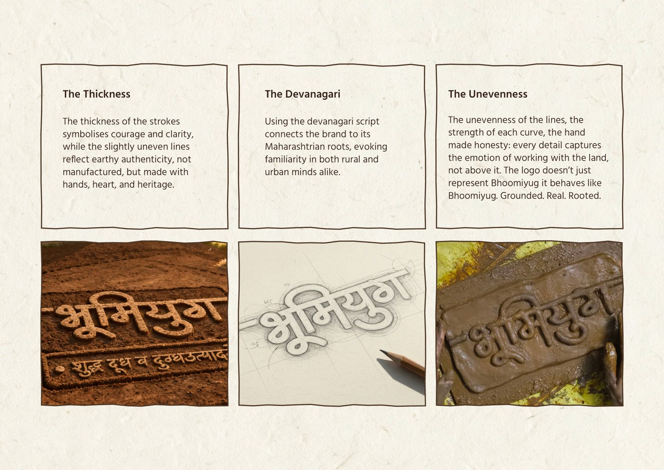
The design strategy bypassed digital trends to forge an identity that felt native to the environment. We returned to the farm to study the physical textures of the earth and the tactile relationship between the farmer and the land.
The concept emerged from the primal act of inscribing the soil. We developed a custom wordmark that mimics the gesture of furrowing a field. The resulting aesthetic is raw and deliberately imperfect, rejecting polished typography in favor of organic strength.

Logo Identity Features
What makes this identity unique is its human touch; deliberately unrefined, emotionally grounded and proudly imperfect. It doesn’t aim to look digital. It aims to feel real.
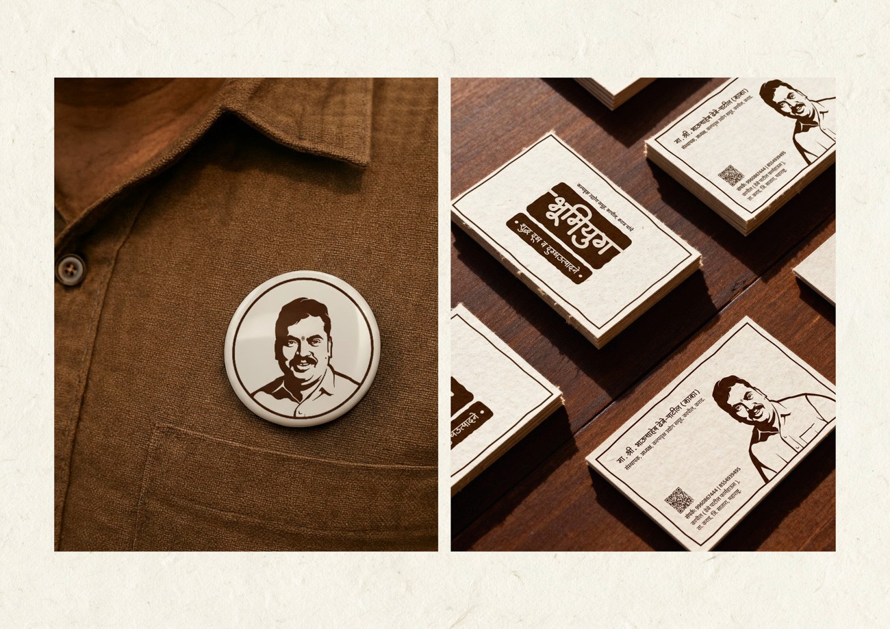
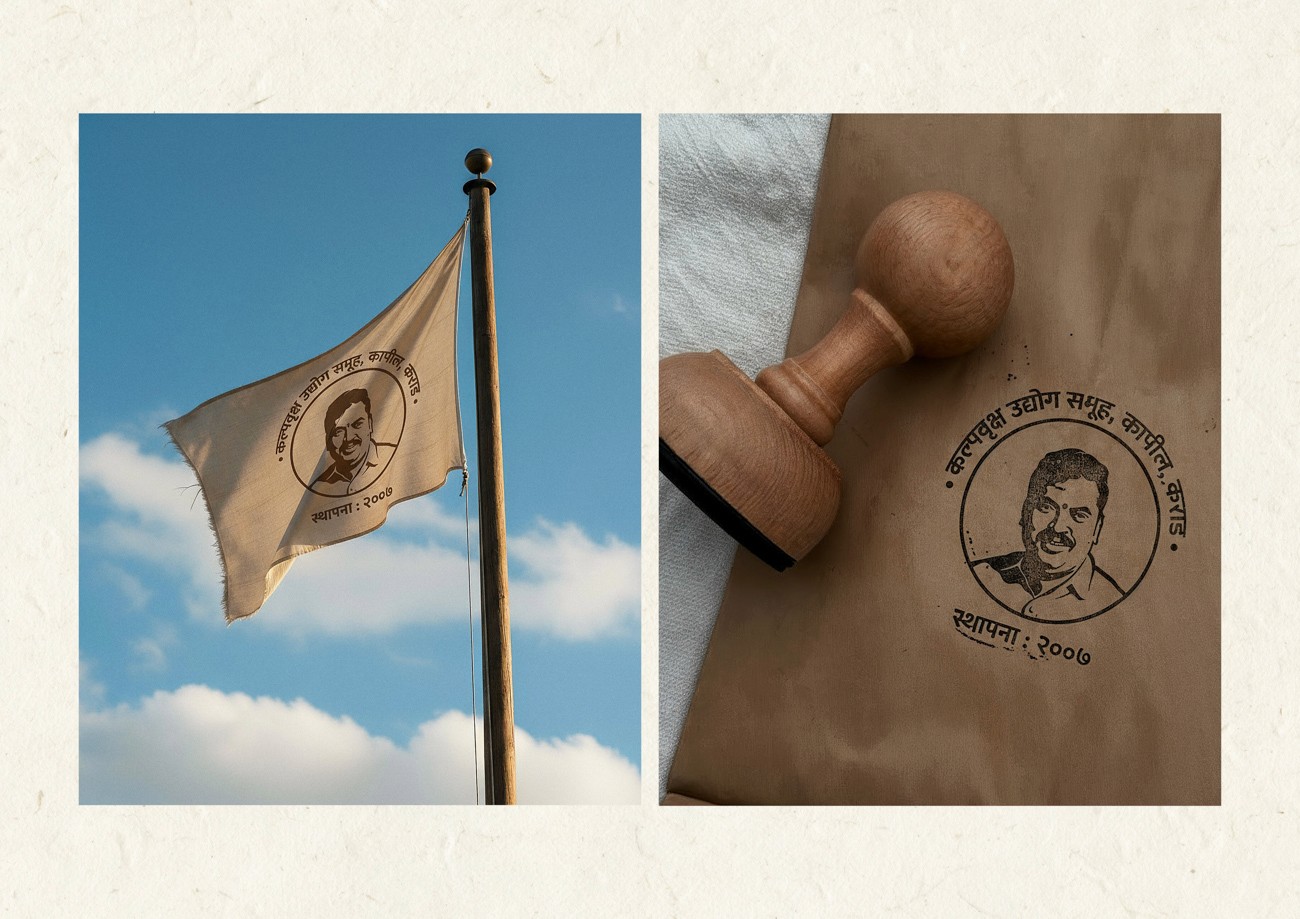
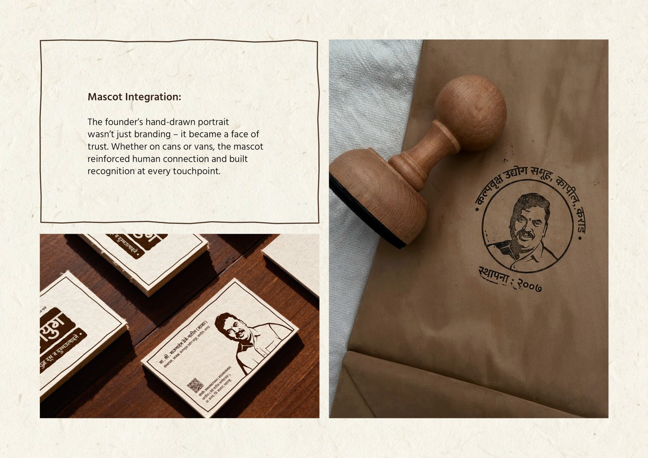
The Brand Mascot
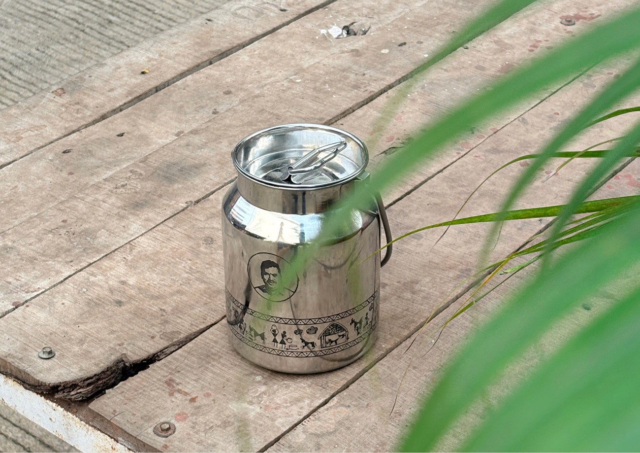
To humanize the visual system, the design team developed a mascot modeled directly on founder Bhausaheb Dhebe Patil. This portrait acts as the brand's emotional anchor and personifies its commitment to trust and agrarian stewardship.
To humanize the visual system, the design team developed a mascot modeled directly on founder Bhausaheb Dhebe Patil. This portrait acts as the brand's emotional anchor and personifies its commitment to trust and agrarian stewardship.
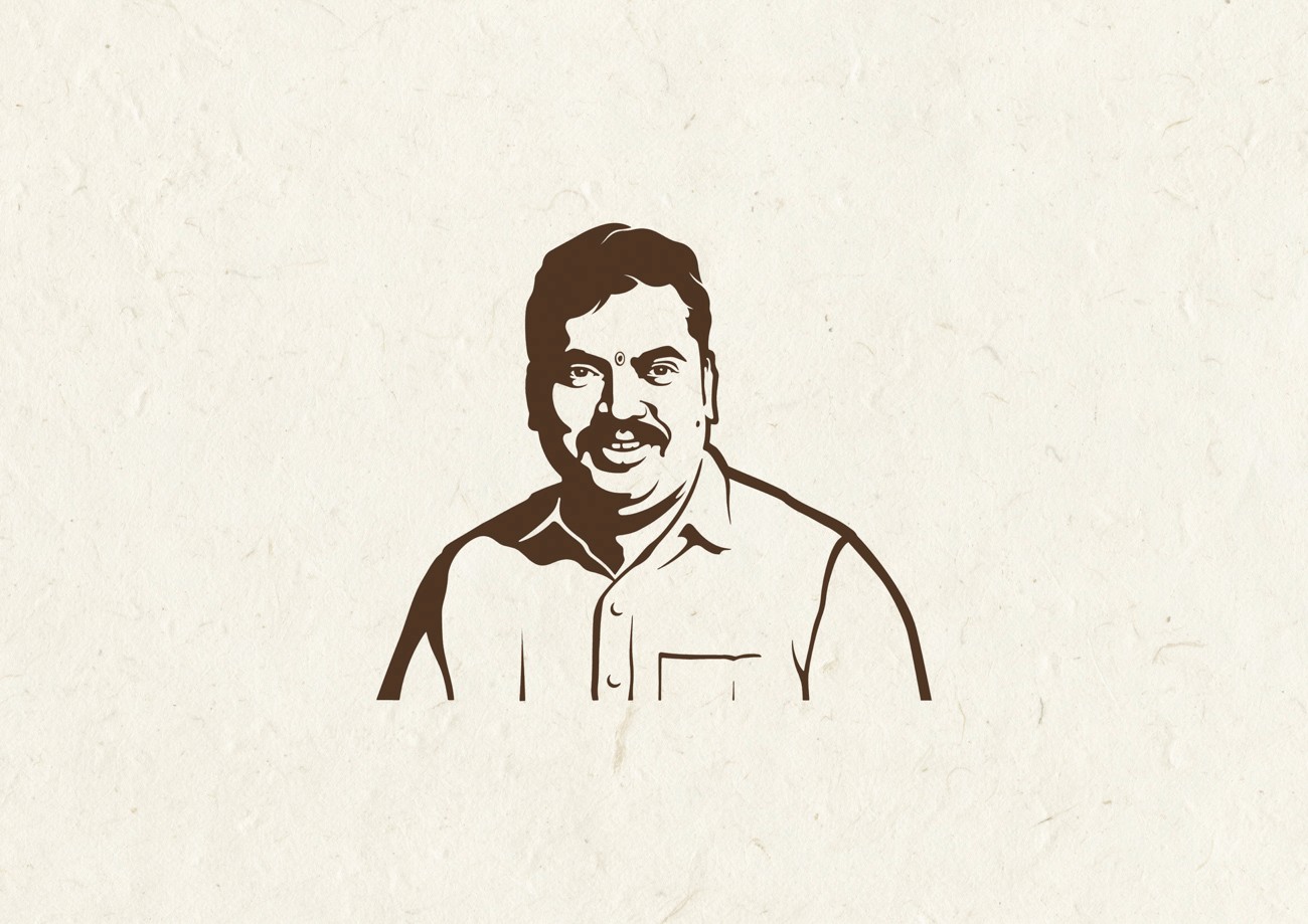

Deployed across all touchpoints, the illustration functions as a seal of authenticity. It reminds consumers that the product originates from a specific individual with uncompromising values, transforming the packaging into a personal guarantee rather than a corporate label.
The Color Palette
The chromatic system is excavated from the landscape rather than selected from a swatch book. The primary palette mirrors the natural spectrum of the soil, ranging from deep black earth to the soft white of purity. These tones are organic and transitional, capturing the raw texture of the field.
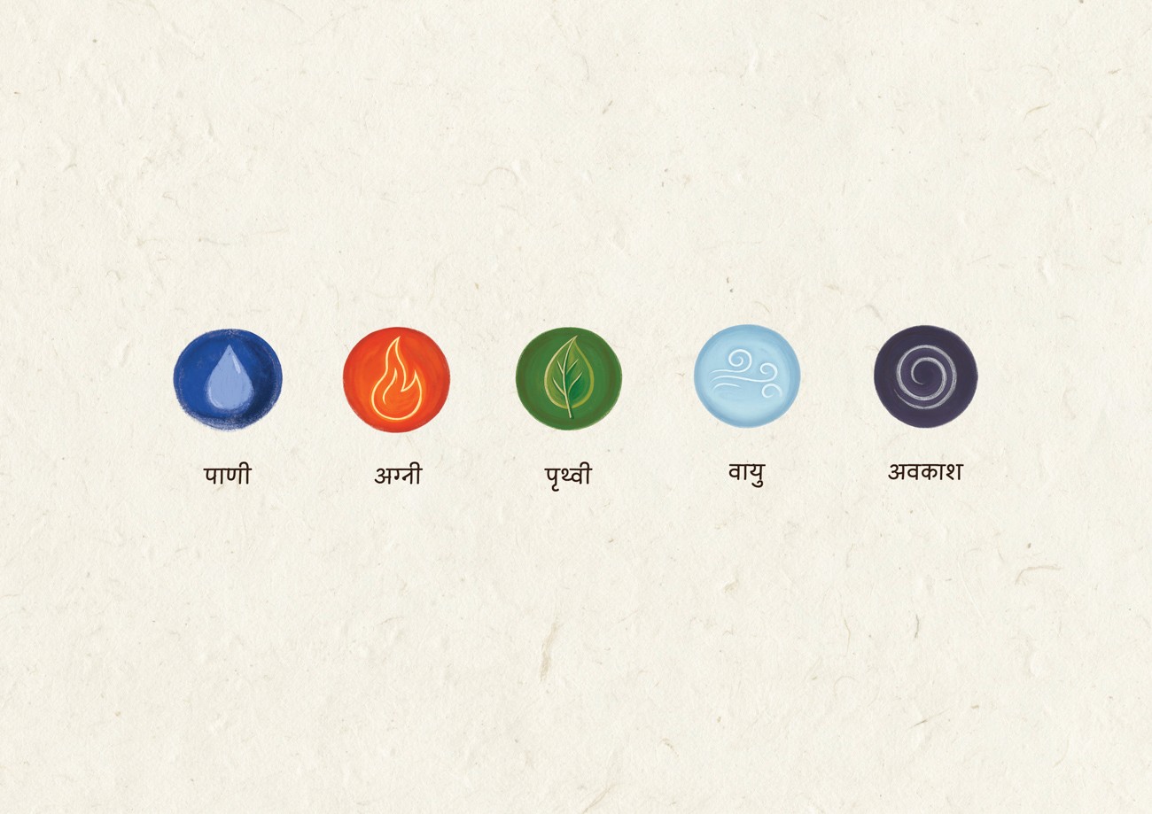
The extended palette draws inspiration from the Pancha Mahabhuta, the five elements of Indian philosophy. Hand-painted textures represent Agni, Vayu, Paani, Pruthvi, and Aakaash to ground the brand in cosmic balance.
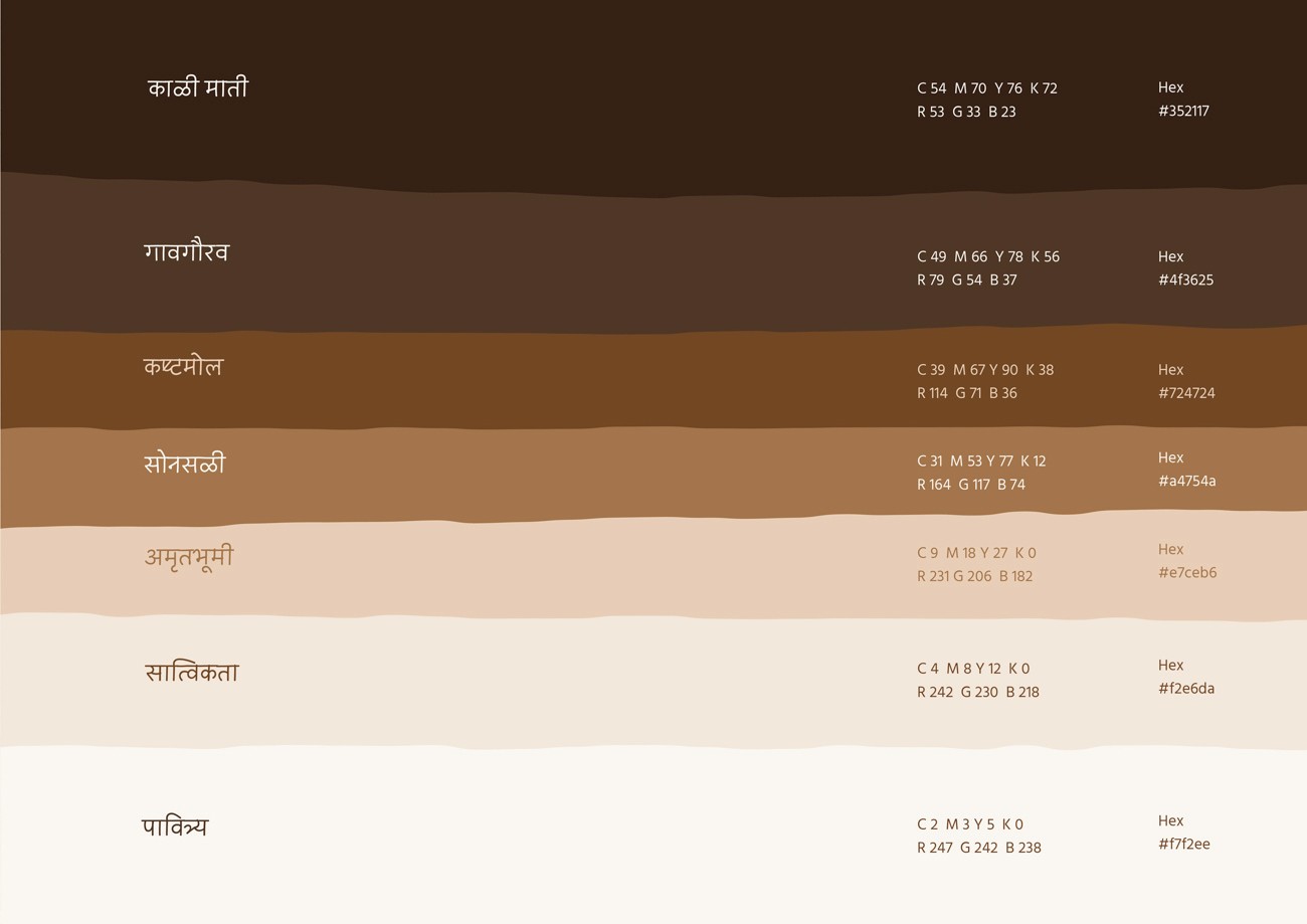
We deliberately rejected synthetic greens and corporate blues. The resulting aesthetic utilizes culturally resonant hues that translate seamlessly from village environments to urban retail, ensuring every touchpoint communicates authenticity.

Brand Typography
The typographic system prioritizes human touch over mechanical precision. We selected a display typeface with a handwritten aesthetic and deliberate imperfections to capture the expressive, grounded rhythm of rural life.
For support, the body font ensures absolute legibility across digital and print formats while maintaining a soft, approachable character. This pairing creates a strategic balance that bridges modern design standards with the brand's traditional, purpose-led soul.

Verbal Identity
The verbal strategy draws directly from the honest cadence of agrarian life. We rejected performative marketing language to cultivate a voice that is rooted, warm, and reliable.
The tone mimics the quiet authority of a village elder. It prioritizes clarity over jargon and wisdom over volume, ensuring every message feels earned rather than manufactured.
This strategic voice serves as a bridge between rural heritage and the conscious modern consumer. It articulates the brand's central tension: the necessary coexistence of progress and purity.

Brand style guide development
The Blueprint of the Brand
Every person carries a style it’s how they’re remembered. Brands are no different. Style is what transforms a brand from a name into a presence. A distinct visual and verbal identity doesn’t just make a brand recognisable, it builds authenticity, trust and long-term recall.

Illustration System
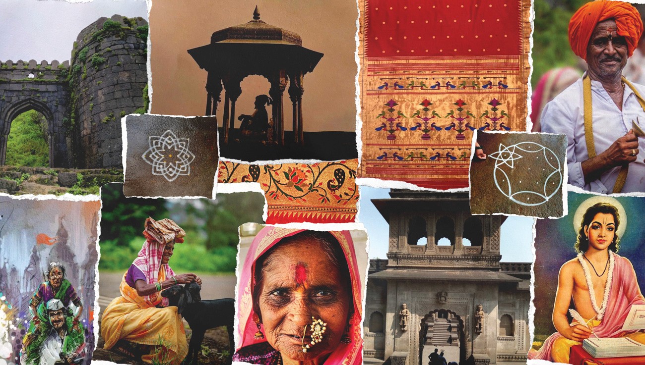
The illustration framework anchors the brand in the cultural landscape of Maharashtra. We developed a handcrafted visual language that captures the authentic rhythm of rural life and the geometry of nature.
The style draws directly from folk art and temple patterns. It prioritizes function over decoration to communicate core values of purity and compassion. This approach creates a seamless bridge between traditional heritage and contemporary design application.


Maharashtrian Style
The visual language treats Maharashtrian culture as a functional design system rather than mere ornamentation. We sourced inspiration directly from regional environments temple carvings, ritualistic rangoli patterns, and the symmetry of Paithani borders to ground the brand in historical significance.
This approach rejects superficial nostalgia in favor of active presence. By embedding these heritage motifs across packaging and spatial design, the system creates an immediate sense of belonging. It signals that Bhoomiyug is not merely observing the culture but is natively born within it.


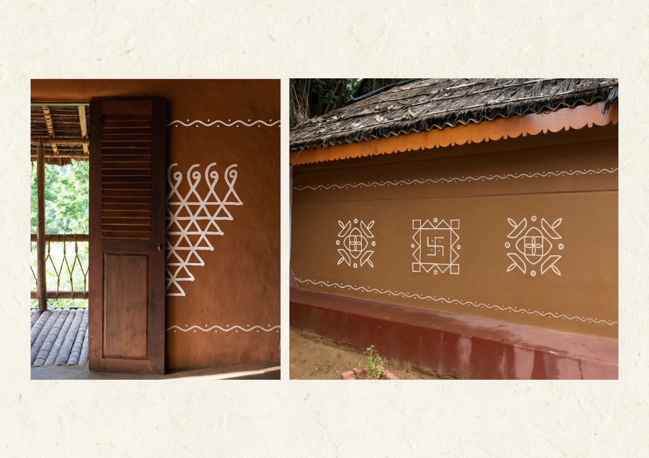
The Textural System (Trinket Style)
To ensure the identity felt alive rather than manufactured, the team developed a proprietary pattern language termed the "Trinket Style." This system rejects digital symmetry in favor of the irregularities found in nature, drawing specific inspiration from leaf veins, cracked soil, and tree bark.
We collaborated with artisans to translate these organic rhythms into a scalable asset library. By utilizing hand-stamped techniques and digitizing real surface imprints, the resulting textures ground the brand in a tactile reality. This approach prevents the aesthetic from feeling over-styled, ensuring every application carries the genuine warmth of the land.

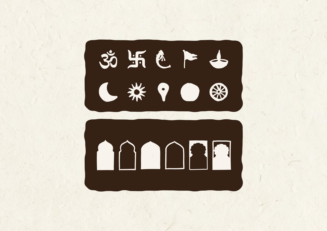
Iconography
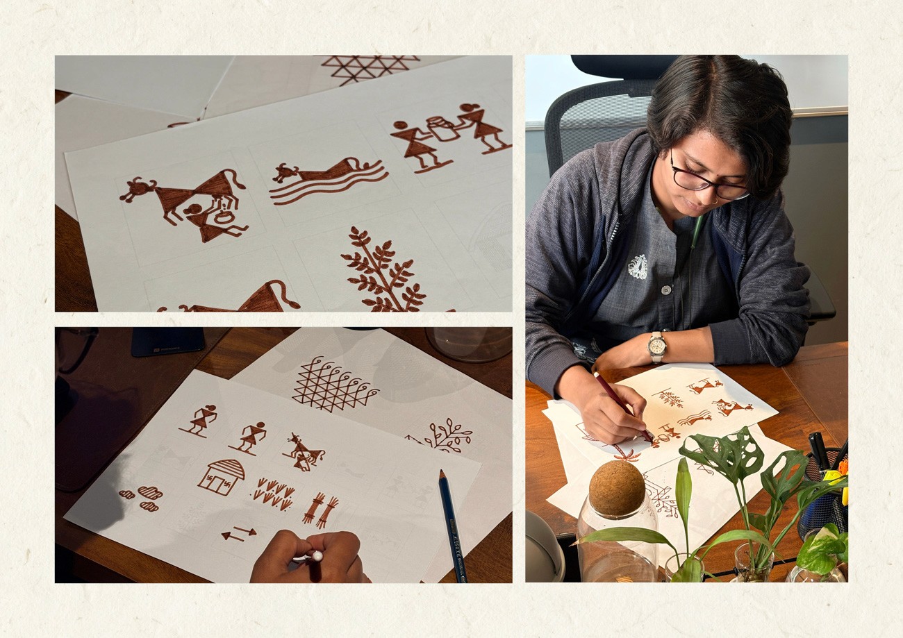
The iconography system functions as a cultural language rooted in Warli art and the minimalist geometry of mud-plastered walls. The design team cultivated these forms to serve as narrative vessels rather than abstract symbols.
The process prioritized observation over digital stylization. We translated lived realities, such as grazing cattle and temple bells, into a cohesive visual shorthand.
While digitally refined for versatility across packaging and interfaces, the icons retain a deliberate roughness. This balance ensures the system remains emotionally grounded while performing seamlessly across modern touchpoints.

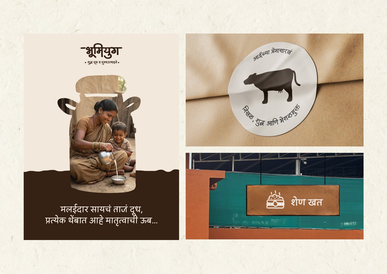
Brand Photography
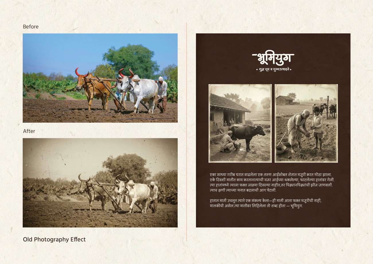
The photographic direction prioritizes emotional truth over studio perfection. We utilized natural light and authentic rural environments to capture the unfiltered beauty of Maharashtra, rejecting artificial polish in favor of honest storytelling.
The visual strategy focuses on tactile reality. We highlighted raw textures like sun-worn skin and brass vessels to ground the narrative in the landscape. To evoke heritage, we applied subtle artistic treatments including watercolor overlays and film grain.
This system functions as the brand's conscience. It validates the origin story and reminds the viewer that the product is rooted in purity, purpose, and place.


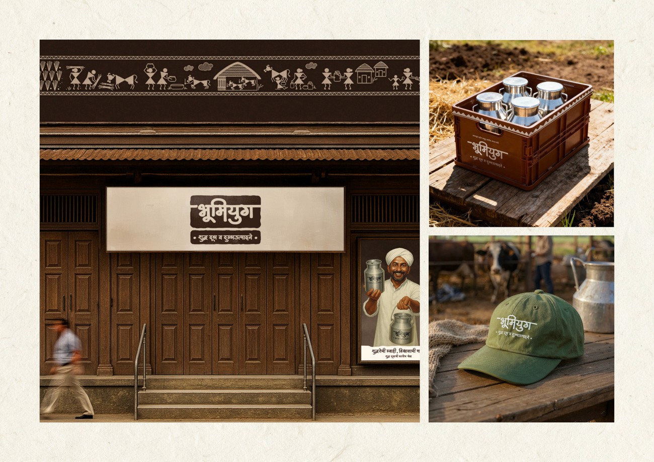
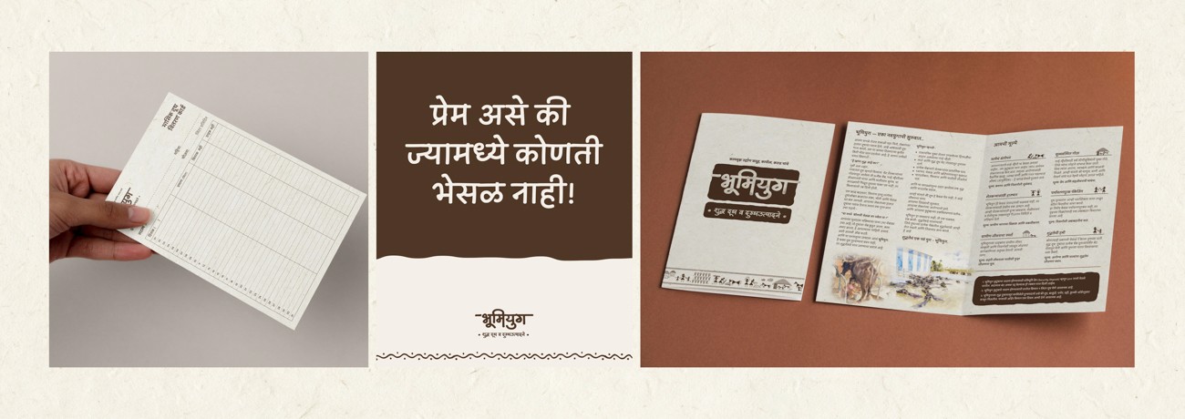
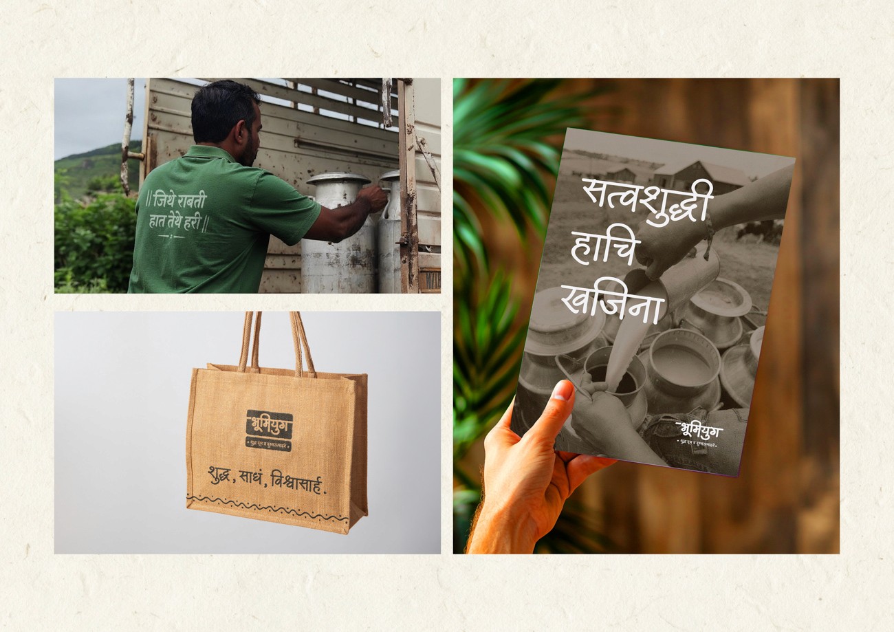
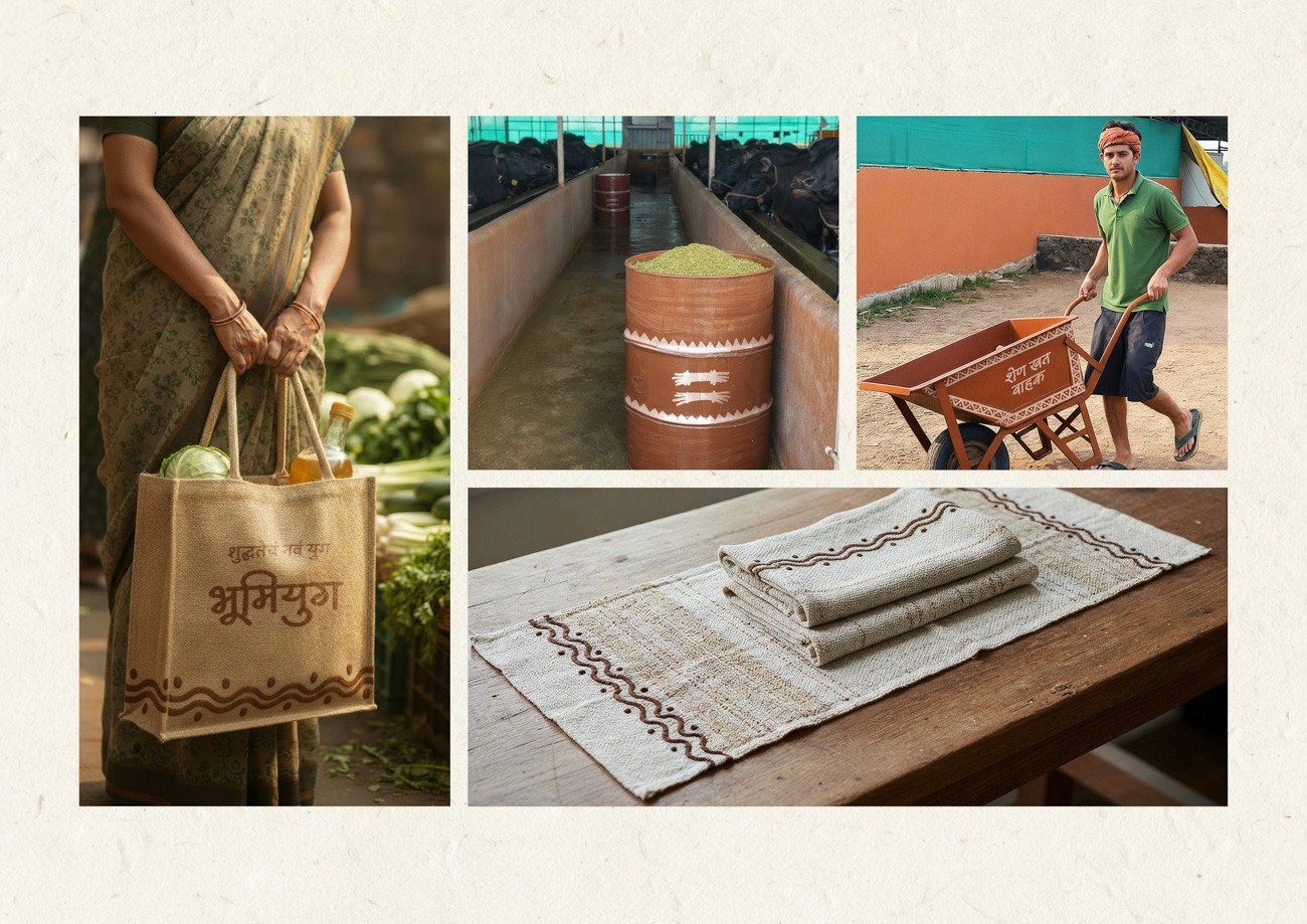
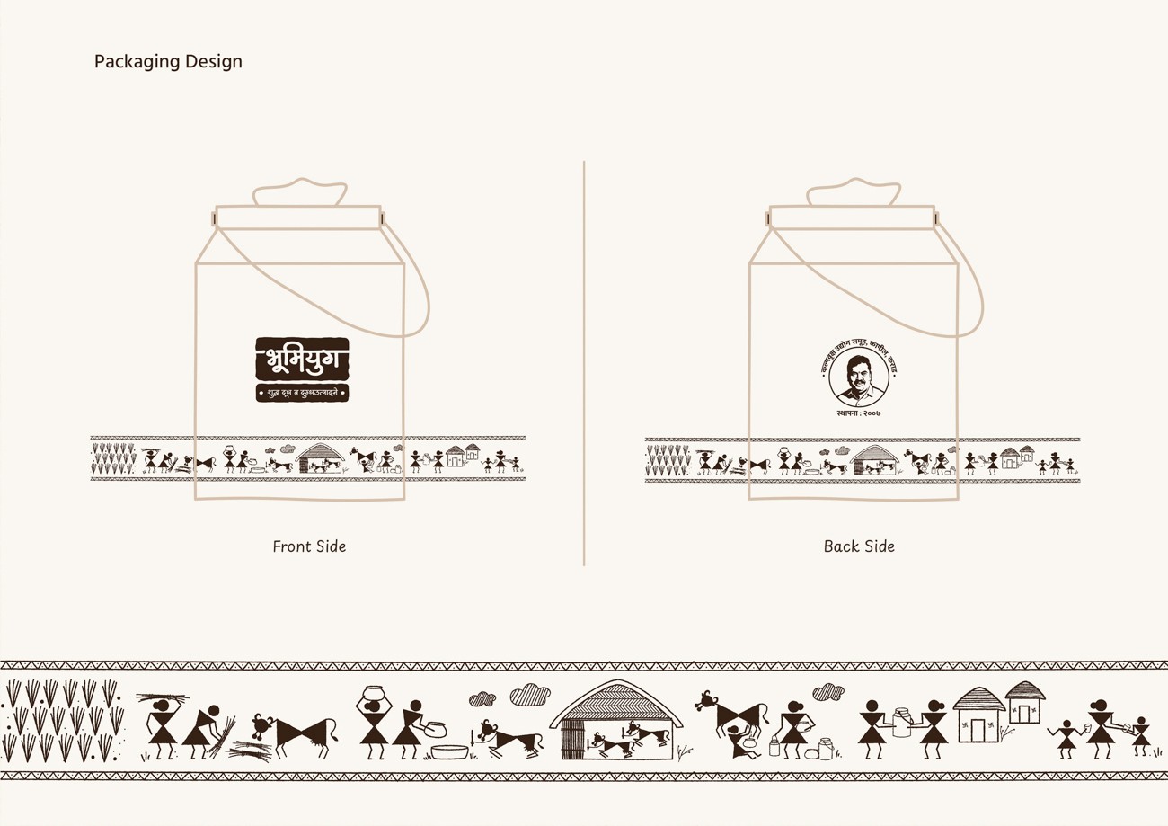
Packaging Design
The packaging strategy elevates the delivery vessel from a utility object to a narrative medium. We treated the surface as a canvas to reinforce the sanctity of the product journey.
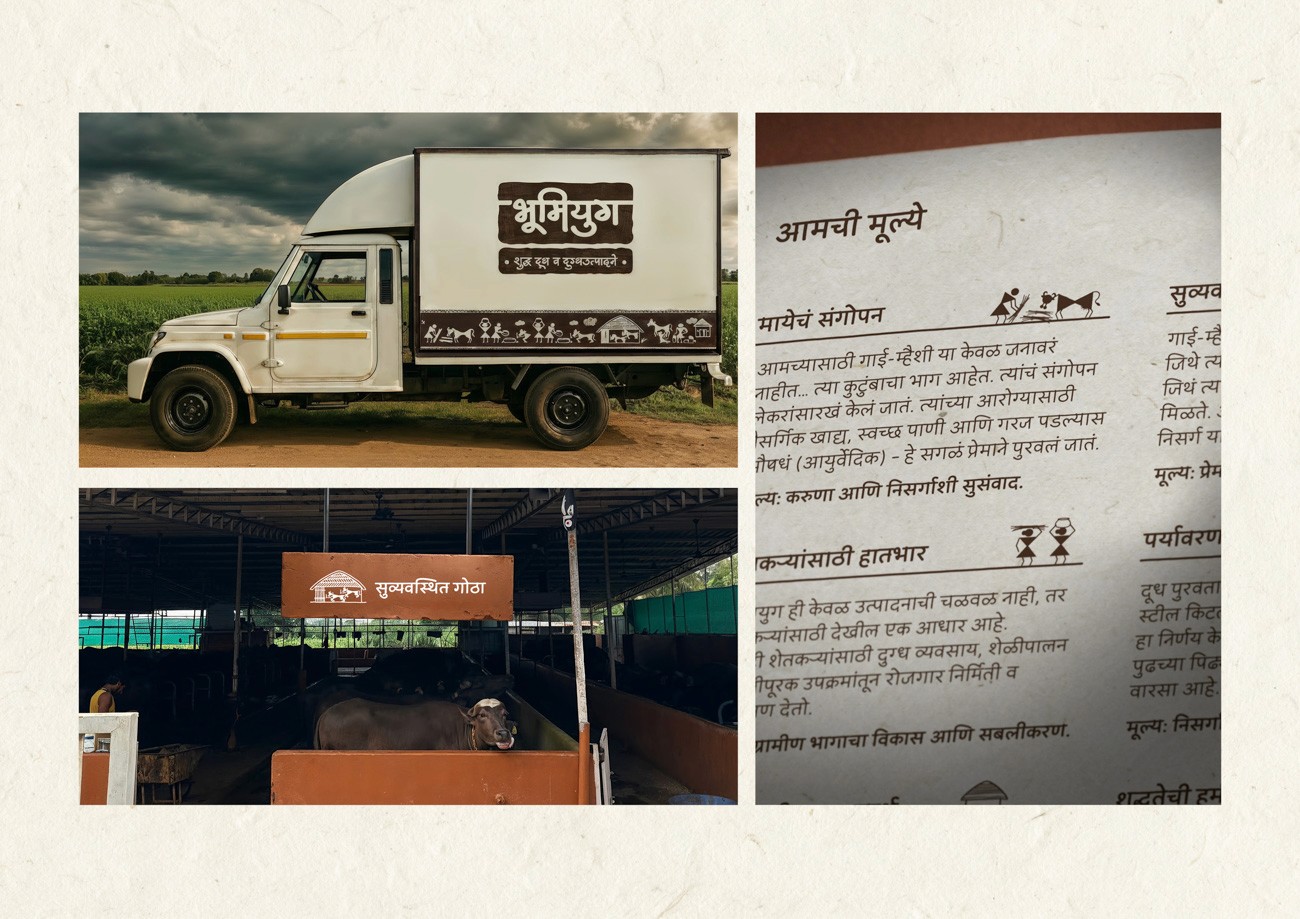
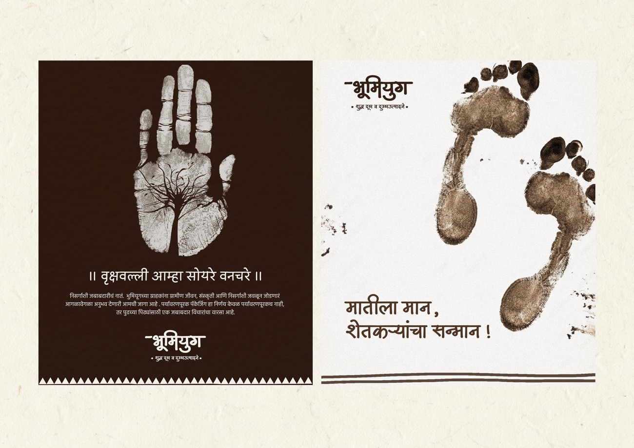
The design features a continuous illustration band inspired by Warli tribal art. This visual loop functions as a memory circle, chronicling the holistic cycle of agrarian life: sowing seeds, nurturing livestock, and the final act of humble delivery.
By wrapping the container in this narrative, the packaging transforms a daily commodity interaction into a ritual of tradition and care.
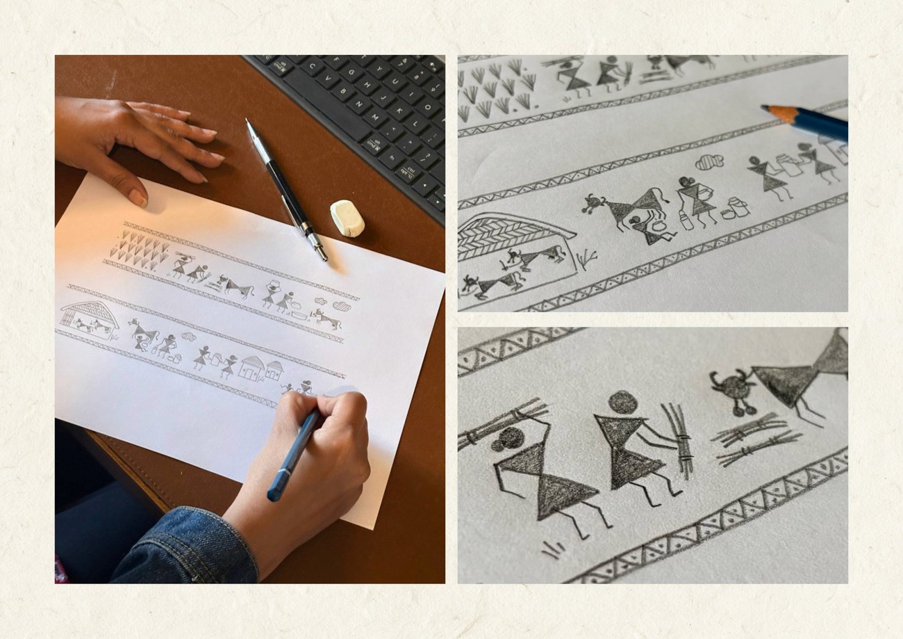
From Sketching to packaging
The execution prioritized timelessness through the use of etched monochrome on steel. We deliberately rejected flashy color palettes to ensure the object felt native to the home rather than the supermarket shelf. The physical form remains clean while the tactile experience offers depth and texture.
This approach transforms the vessel into a cultural canvas. By integrating bespoke illustrations directly onto the material, the packaging serves as a permanent testament to the brand's values of purity, labor, and sustainability.
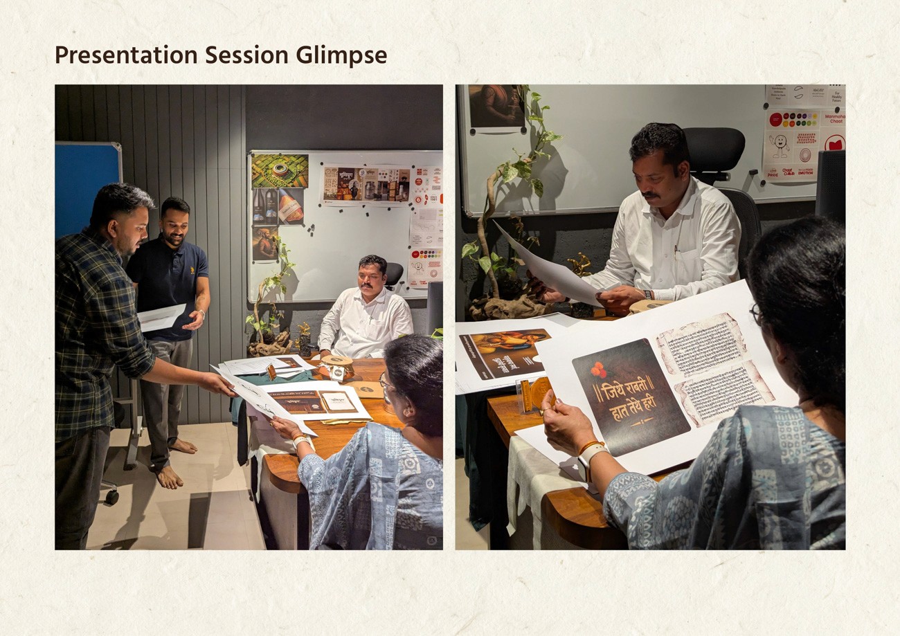
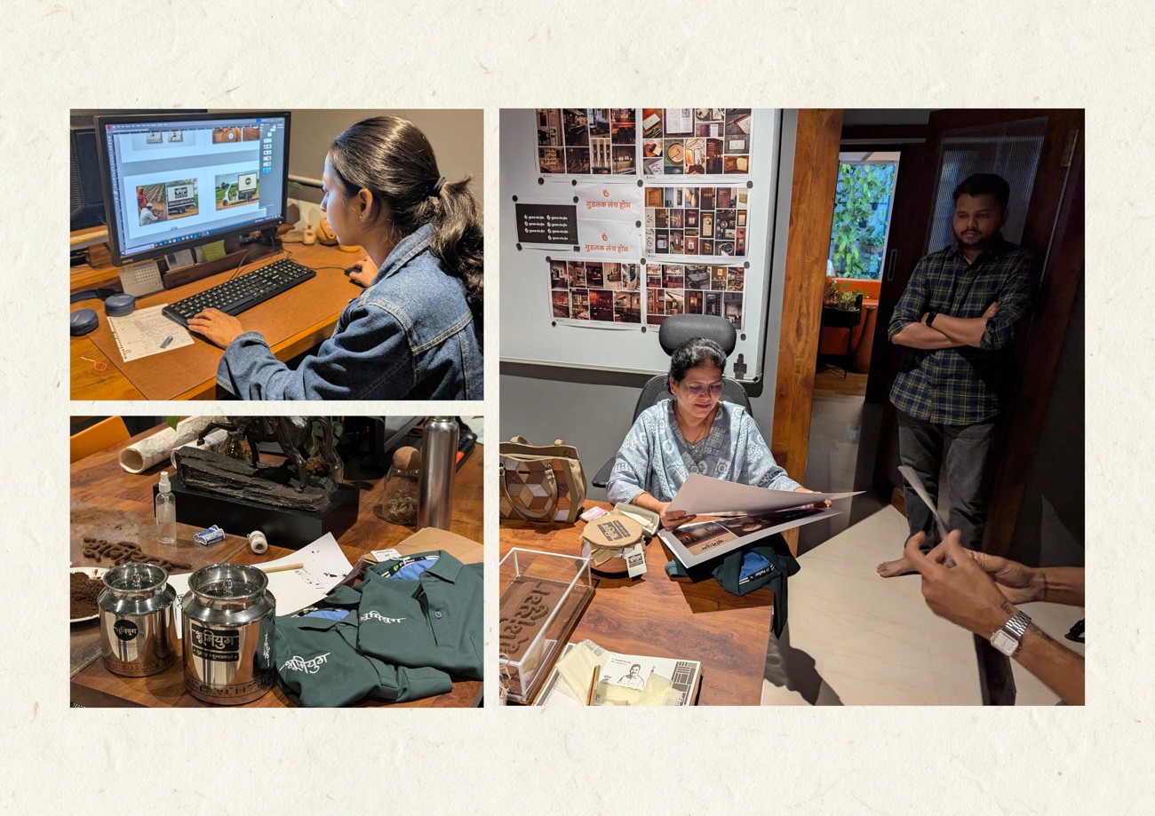
Presentation Session Glimpse
Advertising Campaign
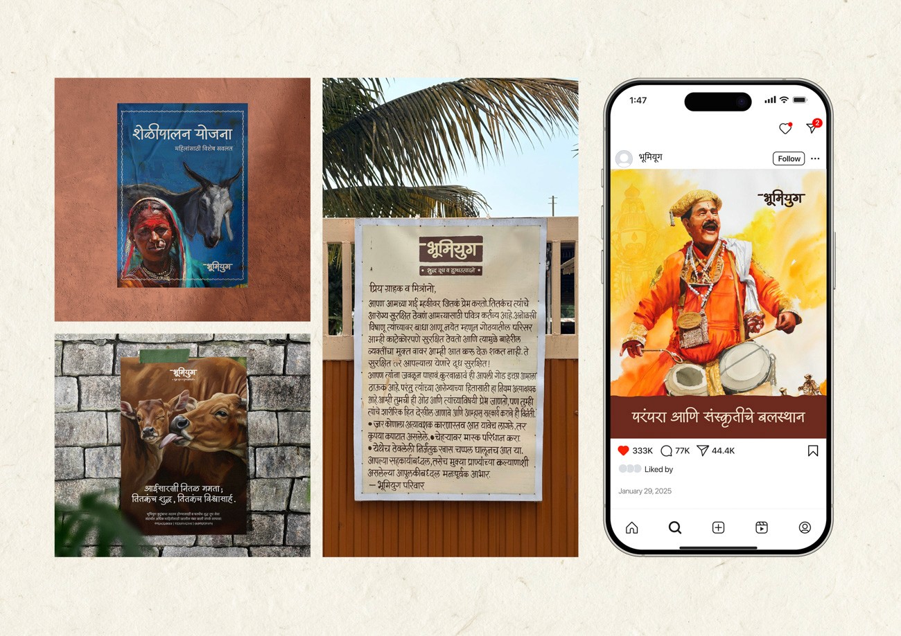
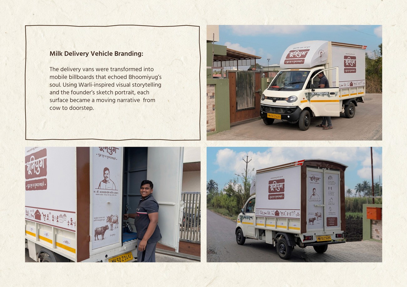
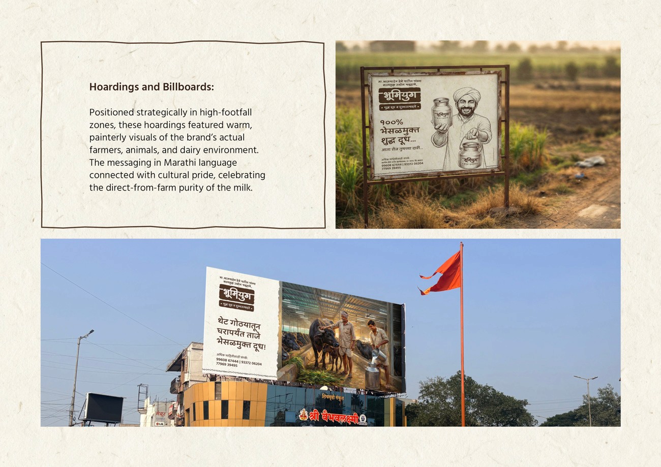
The launch strategy translated the brand’s rooted identity into high-visibility, emotionally resonant mediums. We deployed a mix of static impact and dynamic mobility to establish immediate trust within the community. The visual language leveraged rural warmth and local storytelling to ensure the message felt native to the region.
Delivery vehicles were transformed into moving storytellers, carrying the brand promise across neighborhoods. Outdoor hoardings featured artful renderings of dairy scenes, bridging authenticity with aspiration in high-footfall zones.
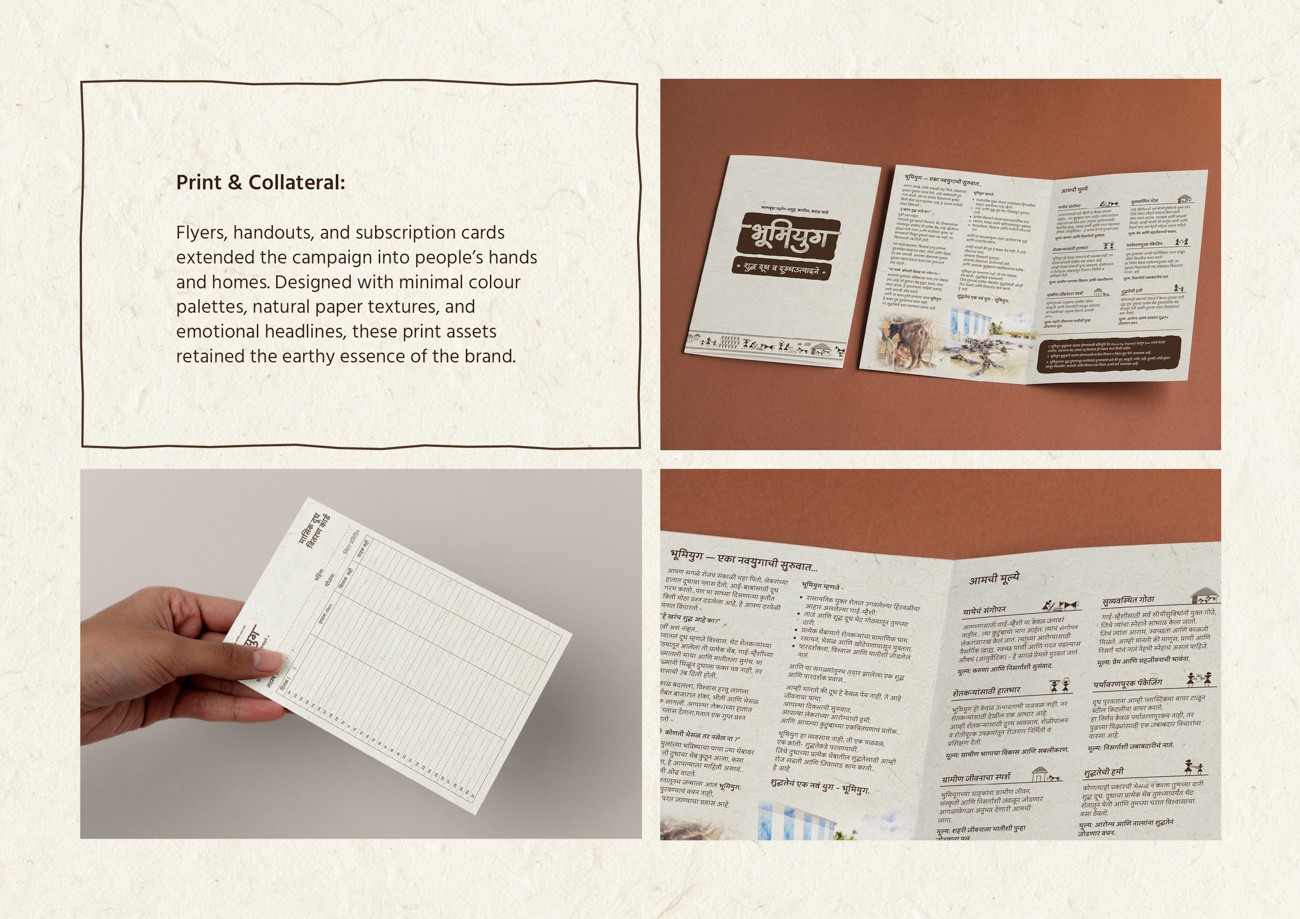
Supporting collateral extended the narrative directly to the consumer's doorstep. By integrating Warli symbolism with Marathi messaging, the campaign generated genuine belief rather than mere awareness.
Project Credits
Strategy Team:
Abhishek Mane
Nikhil Khot
Prajakta Bhosale
Creative Director:
Nikhil Khot
Production Team:
Ganesh Harinkhede
Prajakta Bhosale
Avantika Patil
Somnath Jadhav
Print Support:
Abhishek Nawale
Work with us
If you’re interested in working with us, please do share your details and brief here. Just a headsup, our team will take a few days to get back to you!
© 2025 Lightbugs. All Rights Reserved.