Case study
Aayuvardhanam
Discovery & Positioning

BRAND STORY
Aayuvardhanam is a purpose-led organic grocery brand born out of love for nature and a sustainable lifestyle. Acting as a genuine bridge between consumers and farmers, the brand facilitates the delivery of ethically sourced, organic daily essentials groceries with transparency and trust at its core.
Founded by Vishal and Manish, the initiative was driven by a clear mission: to make a positive impact on human health and the well-being of our environment: for a healthy future.
Aayuvardhanam’s journey with Lightbugs began in early 2020, when the brand had only a few fragmented, locally-developed design assets but a powerful name and a clear, purpose-driven vision. Our task was to transform that meaningful name and vision into a structured, scalable, and soulful brand; one that not only reflects their mission but sets the foundation for a future rooted in purity, purpose and planet-first values.

THE CHALLENGE
Unboxing the Real Problem
The first major challenge was the brand name itself. While Aayuvardhanam carries a beautiful meaning; 'Life Enhancement'. its length and unfamiliar pronunciation often led to confusion. Many people misread or pronounced it as “आयुर्वेदनम्”, mistakenly assuming it to be an Ayurvedic brand rather than an organic grocery brand. This created a strong need to strategically reposition the brand; not only to clarify its category, but also to ensure its correct pronunciation: “आयुवर्धनम्”.
The second key challenge was justifying the packaging design, which formed the most critical part of the brand’s overall experience. With over 40+ products planned for retail and digital platforms, the packaging system needed to function seamlessly across both physical store shelves and e-commerce platforms. This required a thoughtful balance, we couldn’t afford to compromise one experience for the sake of the other. The design solution had to be both aesthetically engaging and functionally consistent across mediums.
Beyond these two primary concerns, the project surfaced several small to medium challenges—including crafting a distinctive market position with a new, non-biased approach in a saturated organic space. Each of these challenges was met with enthusiasm, strategic thinking, and a problem-solving mindset: true to the spirit of Lightbugs.

DISCOVERY AND POSITIONING
INDUSTRY RESEARCH
Unboxing the Real Problem
The history of organic farming in India is not just a story; it is a legacy, deeply rooted in ancient scriptures and traditional practices. Organic farming in India dates back nearly 10,000 years, with roots in the Neolithic Age and the Mesopotamian civilization. Indian epics such as the Mahabharata mention Kamdhenu, the celestial cow, as a symbol of soil fertility. The Vedas also speak extensively about sustainable agricultural practices: Rigveda (2500–1500 BC) discusses organic dung, while Atharvaveda emphasizes its use as fertilizer. Ancient scholars like Shukra and Kautilya (in Arthashastra) spoke of nurturing plants with animal dung and green manure, pointing to a blend of tradition and science that formed the foundation of sustainable farming.
Through this exploration, one thing became evident, organic farming is not a trend in India; it's a timeless tradition with a scientific base and cultural depth.
This research became the first spark for the brand’s visual strategy. It guided us to preserve a traditional and grounded touch within the visual language of Aayuvardhanam.

COMPETITIVE LANDSCAPE RESEARCH
Diving deeper into the "what",what the market offers, what consumers seek and what gaps exist.
The organic grocery market is rapidly expanding, yet consumer trust and brand differentiation remain key challenges. While many labels present themselves as “organic”, too often they fall short lacking transparency, traceability or the emotional resonance that turns a purchase into a relationship.
Although the market is flooded with organic products, today’s consumers are searching for something deeper: authenticity, understanding, and ethical sourcing. For them, food is no longer merely a commodity, it is an expression of their values. Yet only a handful of brands genuinely connect farmers and consumers in a way that feels both honest and meaningful, while remaining rooted in the aesthetics and traditions of India.

This is where we saw an opportunity for Aayuvardhanam to lead — not just as a product brand, but as a movement anchored in tradition, driven by purpose and guided by a planet-first philosophy.
Key Explorations, Discoveries & Insights
Consumer Insight:
People no longer just want to “eat healthy”. They want to know their food’s journey. Brands that humanise this journey, especially by bridging farmers and consumers, earn deeper trust and loyalty.
Cultural Truth:
India’s agricultural and culinary heritage is both revered and underrepresented in contemporary branding. There’s an powerful, emotional need to revive and respect these roots through visual and verbal identity so they resonate with modern audiences while preserving their authenticity.
Target Audience:
Health-conscious urban consumers who seek groceries that are authentic, traceable, and ethically sourced. They are motivated by lifestyle choices, cultural pride, and a sense of environmental responsibility.
Primary Research:
Through documentaries, podcasts, campaigns and visits to organic food stores, we observed a clear shift toward slower, more sustainable and regionally rooted food practices. At the same time, there is growing fatigue with generic “organic” claims that feel hollow or unsubstantiated.
Secondary Research:
Consumers seek truth, not trends! Consumers are increasingly drawn to truth over trends. Cultural pride in traditional farming remains strong but it is rarely celebrated or made visible in today’s marketplace.
Expanded Audience Perspective:
Beyond health-conscious consumers, this includes those invested in environmental and biodiversity welfare individuals who value ethics, traceability and simplicity as guiding principles in their choices.

BRAND POSITIONING STATEMENT

BRAND PERSONALITY ROOTS

BRAND VISUAL IDENTITY
When purpose takes shape

BRAND WORDMARK
When purpose takes shape
To solve a real-world problem and make a bold statement, we built the brand name in Devanagari. Choosing Devanagari for Aayuvardhanam’s name was more than an aesthetic decision. It was an intentional, values-driven move. In a marketplace dominated by Latin-script logos, Devanagari restores authenticity, grounding the brand in its cultural roots.

BRAND WORDMARK
True Name, True Voice
This choice directly addressed a real-world challenge: the frequent mispronunciation and misconception of the name आयुवर्धनम्. By embracing its original script, the brand not only safeguarded its identity but also celebrated the linguistic and cultural heritage from which it was born.
A Signature That Stands Apart
The result is a distinctive visual signature: one that feels familiar and trustworthy to Indian consumers while standing apart from generic, globalized branding. It signals a brand deeply connected to India’s traditions yet conscious of today’s discerning, health-focused audience.
True to Its Roots, Built for the Future It positions Aayuvardhanam as a brand that speaks the truth of its identity: rooted in India, designed for a healthier tomorrow!


BRAND COLOUR PALETTE
Colours That Cultivate Connection
Colour is one of the most powerful tools for shaping perception, and for Aayuvardhanam, it became a visual embodiment of the brand’s philosophy. We deliberately chose a warm, earthy palette anchored in soil brown, soft beige cream and muted natural tones to reflect the farming-first values at the heart of the brand. These hues don’t simply complement the logo; they carry the story of the land, the harvest and the trust between farmer and consumer.
In branding, colour influences over 90% of human perception, shaping emotional responses long before words or symbols are processed. By grounding Aayuvardhanam’s identity in organic, nature-inspired tones, we established a sense of trust, simplicity and authenticity that resonates with health-conscious consumers.
Rather than chasing fleeting trends or predictable “eco-green” clichés, this palette is deliberately restrained and timeless. This palette does more than complement the brand. It defines its voice. It gives Aayuvardhanam a confident yet grounded presence in a competitive market, ensuring the brand is not only seen but also felt, remembered and trusted.
Every shade is a quiet affirmation: care for the earth, respect for tradition and belief in a healthier future: ensuring the brand’s essence is experienced, not just observed.

BRAND VERBAL IDENTITY
Where Purpose Finds Its Voice
Following the creation of Aayuvardhanam’s visual identity, we moved into shaping how the brand would sound and speak. The verbal identity is the voice of the brand — how it communicates across platforms, connects with its audience, and builds trust through tone and language.
Grounded in the brand’s purpose and belief system, we developed a clear verbal identity framework that reflects Aayuvardhanam’s values in every word.

BRAND STYLE DEVELOPMENT
The Blueprint of the Brand

Every person carries a style — it’s how they’re remembered. Brands are no different. Style is what transforms a brand from a name into a presence. A distinct visual and verbal identity doesn’t just make a brand recognisable, it builds authenticity, trust and long-term recall.
For Aayuvardhanam, the founders made a bold, future-focused choice: to capture the very soul of the brand and codify it into a timeless style system. Not just for today’s campaigns, but as a guidepost for every stage of its journey ahead. We crafted a comprehensive Brand Style Guide that translates purpose into design, emotion into visuals, and values into communication. It ensures that whether on a product label, a social campaign, a store sign, or a digital touchpoint, Aayuvardhanam feels unmistakably itself.
This guide isn’t just a set of rules it’s a living blueprint, empowering internal teams and external partners to express the brand with consistency and integrity. It enables them to execute campaigns, packaging and communication strategies confidently, without ever diluting Aayuvardhanam’s essence or straying from its core identity.


BRAND PACKAGING
That Speaks Before the Product
Packaging is often the first physical interaction a consumer has with a brand and first impressions matter. Great packaging goes beyond aesthetics; it informs, engages and builds trust. It communicates the brand’s values, story and promise even before the product is used. Whether on a store shelf or an e-commerce listing, packaging has the power to shape perception, create recall, and turn a product into an experience. It’s not just design, it’s strategy made visible!

CONSUMER INSIGHTS
Listening to the Questions That Matter

Many consumers raised these questions: Concerns around authenticity, transparency and trust were recurring themes throughout our research. We found there is lack of awareness in this industry.
We also discovered that by choosing organic, user indirectly contribute to a healthier planet because organic farming practices support soil health, biodiversity and ecological balance, making the act of consumption an act of care. Choosing organic becomes an act of responsibility and hope, not merely a lifestyle trend.
From Insight to Action
This insight became foundational to Aayuvardhanam’s brand messaging. Among all brand touchpoints, packaging stood out as the most interactive medium — a direct channel to engage with consumers. It offered the opportunity not only to deliver the product, but also to educate, inform and communicate the brand’s deeper purpose behind every item. Our packaging strategy was designed to convey this message clearly, turning every purchase into a moment of awareness.
Our research revealed a significant gap in consumer awareness. Despite growing interest in organic living, we found that knowledge around its long-term benefits, sourcing practices and environmental impact is still limited.
Packaging as a Platform for Truth

Among all brand touchpoints, packaging emerged as the most intimate and interactive medium. A silent storyteller in consumers’ hands. It presented an opportunity not only to deliver the product but also to educate, inform and inspire. So, to tackle this, we used packaging as a platform for truth and designed brand packaging that leads with transparency.
Front Panel:

On the front, we boldly displayed the origin of each product — naming the specific region it came from and included key benefits to gently educate and guide even those unfamiliar with organic choices. To deepen cultural resonance and ensure compliance, we placed the Devanagari version of every product name alongside English, weaving tradition into modern design. This considered approach not only honours Aayuvardhanam’s cultural roots but also positions the packaging as future-ready, authentic, and aligned with the brand’s greater purpose.
Back Panel:

On the back, the packaging becomes a storyteller. It doesn’t just list ingredients, it explains why the product was sourced from a particular region, grounding every purchase in provenance and purpose. By highlighting the unique health benefits and environmental value of each item, we transformed the back of the pack into a space of learning and trust-building. This layer of detail not only assures consumers of authenticity but also deepens their connection with the farmers, land and practices behind what they consume: making the act of buying organic a conscious, informed choice.
This design approach wasn’t just informative — it was intentional.
By embedding education and honesty into the product experience, we transformed packaging into a moment of awareness: a medium where Aayuvardhanam doesn’t just sell honestly, but speaks openly, differentiating itself in a crowded market.

PHOTOGRAPHY STYLE
We directed Aayuvardhanam’s photography to capture more than products: we captured a philosophy. Each image was crafted to showcasing the purity of ingredients within their natural context. By integrating earthy props, natural light and rustic textures, the imagery reflects both authenticity and aspiration. This consistent visual language sets the tone for all future launches, ensuring the brand remains rooted in farming traditions while appealing to the targeted audience.


UNBOXING EXPERIENCE
The Experience Inside the Experience

As Aayuvardhanam expanded into e-commerce, we saw the unboxing moment as a powerful opportunity to extend the brand story beyond the screen. Every package was designed not just to deliver a product, but to deliver purpose. The unboxing experience included thoughtful elements that spoke to the brand’s values — from the founders' story and mission to subtle cues of care, sustainability, and tradition.
One of the most impactful additions was the ‘Seed Ball’ initiative; introduced during the monsoon season. Each box included a small pouch containing indigenous tree seed balls, encouraging customers to throw them into open soil during their travels or to plant them locally.

This simple act allowed every customer to contribute to reforestation and biodiversity, making them a part of the movement. The unboxing evolved with the seasons — continuously introducing new layers of engagement and purpose, ensuring that every delivery felt personal, thoughtful and aligned with a healthier future.
BRAND MESSAGING
The Line That Carries It All

From all our strategic insights and brand truths, we arrived at a simple yet powerful tagline: “For a Healthy Future.” This line encapsulates the very essence of Aayuvardhanam. Every aspect of the brand from the way the products are grown, to how they’re packaged, consumed and the values they promote contributes to a future that is healthier for individuals, farmers and the planet. The tagline unites the brand’s purpose into a forward-facing message that’s hopeful, inclusive and deeply rooted in intent.
DESIGN FOR WEB
Where Purpose Meets Platform
Following the brand style guide, we developed Aayuvardhanam’s official website on Shopify, ensuring that the digital experience reflected the same authenticity and clarity as the brand itself.
Our scope included complete UI/UX design, brand-aligned copywriting, and curated imagery, cover page posters, photography that together deliver a seamless, engaging experience. Every element from layout to language was guided by the brand style guide, ensuring consistency across platforms.


AMAZON BRAND STORE
Where Purpose Meets Platform
In addition to the website, we also developed Aayuvardhanam’s Amazon Brand Store, ensuring a seamless and consistent experience across all digital platforms. From interactive, story-led copywriting to brand-aligned visual design, every element was carefully crafted to reflect the brand’s identity and values.
The Amazon storefront wasn’t treated as a secondary platform — it was built with the same level of intent, detail, and design discipline as the website. The result is a shopping experience that feels cohesive, credible and uniquely Aayuvardhanam — no matter where the customer engages.


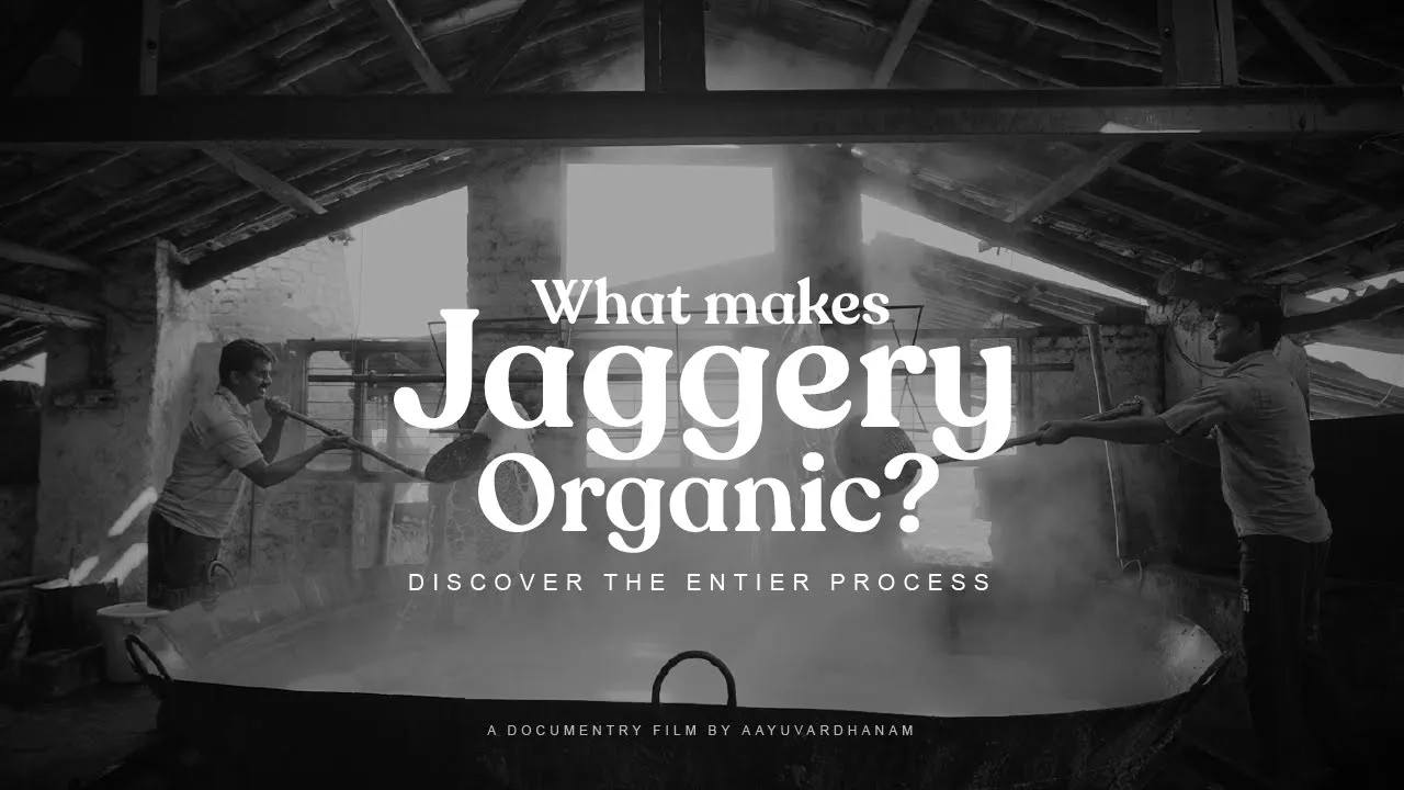
ADVERTISING CAMPAIGNS
Taking the Story from Soil to Society
Once the core brand elements were in place, we moved into execution crafting advertising campaigns that brought Aayuvardhanam’s purpose to life in the public eye.
We still remember the founder’s words: “You’ve given birth to this brand now take responsibility to help it grow.” That line stayed with us, and shaped the way we approached every campaign not just as designers or marketers, but as brand guardians.
What followed were story-led, values-driven campaigns rooted in culture, honesty, and simplicity a reflection of everything Aayuvardhanam stands for. Here are a few highlights from the campaigns we proudly brought to life.


From the Founders, With Heart


"We came to Lightbugs with just a name and a vision. What they gave us was a soul.
Aayuvardhanam didn’t feel like a project — it felt like a child we were raising together. They listened like partners, built like artists, and cared like family.
Every touchpoint they created carries our truth. And that’s rare.”
- Vishal & Manish Founders, Aayuvardhanam
Work with us
If you’re interested in working with us, please do share your details and brief here. Just a headsup, our team will take a few days to get back to you!
© 2025 Lightbugs. All Rights Reserved.